ttk Entry
In Tkinter, the ttk entry widget (ttk input box) is an enhanced version of the standard entry widget. While both widgets serve the same basic purpose of allowing users to input text, the ttk entry widget typically has a more modern, themed look compared to the plain appearance of the standard entry widget.
If you want to know about how the Entry widget works on the inside in detail, I suggest checking out the Tkinter Entry Secrets: Design and Validation guide. It explains everything about how the entry widget works in Tkinter. You’ll learn stuff like entry widget indexes, validate user input, and other essential tricks.
In this tutorial, we’ll cover how to create and customize ttk entry widgets, style them, perform input validation, and bind events for interactivity. By the end, you’ll know how to make stylish and useful input boxes in Tkinter.
Creating Your First Ttk Entry Widget
Let’s start by creating your first ttk input box in Tkinter.
To create a ttk entry widget, you’ll need to import the ttk module from Tkinter. Then, you can use the ttk.Entry() function to make your entry box.
Example:
from tkinter import *
from tkinter import ttk

root = Tk()

ttk_entry = ttk.Entry(root,  font='georgia 24 bold', foreground='green')
ttk_entry.pack()

root.mainloop()
Output:

Customize Your ttk Input Boxes
Now, let’s learn how to customize the ttk input boxes by using its mostly used options.
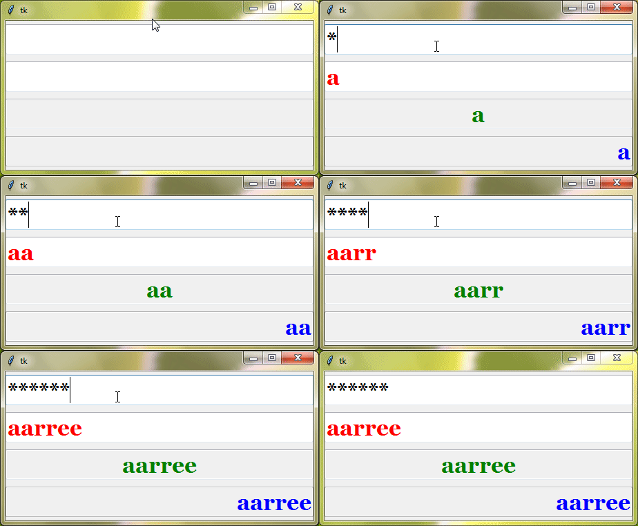
The state option allows you to control the behavior of the ttk Entry widget. It has three states:
"normal": Users can type into the entry."readonly": Users can view the content but cannot edit it."disabled": Interaction with the entry is completely disabled.
With the show option, you can enhance security by hiding sensitive information entered into the input box. It replaces each character with a placeholder, such as asterisks, to prevent the content from being visible.
The width option enables you to adjust the width of the input box according to your design preferences.
By using the textvariable option, you can connect your ttk Entry widget to a StringVar() variable. This connection automatically updates the input box’s content in real-time whenever the associated variable changes.
In addition to these options, ttk Entry also supports some extra standard options.
cursorfontforegroundstyletakefocusxscrollcommand
If you’re curious to learn more about the options mentioned above, take a look at the Tkinter Standard Options and ttk and ttk style.
Example:
from tkinter import *
from tkinter import ttk

# Create the Tkinter root window
root = Tk()

# Create a StringVar to hold the entry's value
new_var = StringVar()

# Create a masked entry (password entry)
masked_input = ttk.Entry(root,  font='georgia 24 bold', width=20, textvariable=new_var, show='*')
masked_input.pack(pady=5)  # Add padding below the widget

# Create a normal entry (editable entry)
normal_entry = ttk.Entry(root,  font='georgia 24 bold', width=20, textvariable=new_var, state='normal', justify='left', foreground='red')
normal_entry.pack(pady=5)  # Add padding below the widget

# Create a read-only entry
readonly_entry = ttk.Entry(root,  font='georgia 24 bold', width=20, textvariable=new_var, state='readonly', justify='center', foreground='green')
readonly_entry.pack(pady=5)  # Add padding below the widget

# Create a disabled entry
disabled_entry = ttk.Entry(root,  font='georgia 24 bold', width=20, textvariable=new_var, state='disabled', justify='right', foreground='blue')
disabled_entry.pack(pady=5)  # Add padding below the widget

# Start the Tkinter event loop
root.mainloop()
Output:
Style Your ttk Entry
Styling your ttk input boxes is a great way to personalize their appearance and make them blend seamlessly into your application’s design. Let’s explore how you can style your ttk Entry widgets effectively.
To begin styling ttk Entry widgets, you first need to create an instance of the ttk.Style() class:
style = ttk.Style()
Once you have the style object, you can configure the appearance of ttk Entry widgets using the style.configure() or style.map() methods.
The general syntax for styling ttk Entry widgets is as follows:
style.configure('TEntry', option=value, ...)In this line of code, 'TEntry' is the class name for ttk Entry widgets. By configuring this class, you can apply your chosen styling options to all ttk input boxes in your application.
But what if you want to style only specific input boxes differently?
To do this, you can create custom class names for them. Simply append a custom name before the base class name 'TEntry', and you’ll have your custom class name.
For instance, you can define a custom class name such as "MyCustomEntry.TEntry" and configure its style options using the following code:
style.configure('MyCustomEntry.TEntry', option=value, ...)Once you’ve configured the custom class, you can then assign it to the style options of those specific ttk entry widgets you want to style differently.
Example:
from tkinter import *
from tkinter import ttk

root = Tk()

style = ttk.Style()

style.configure('TEntry', foreground = 'red')
style.configure('myCustomEntry.TEntry', foreground = 'green')

entry_with_default_styling = ttk.Entry(root,  font='georgia 24 bold', width=20)
entry_with_default_styling.pack(pady=5)

entry_with_custom_styling = ttk.Entry(root, font='georgia 24 bold', width=20, style='myCustomEntry.TEntry')
entry_with_custom_styling.pack(pady=5)

root.mainloop()
Output:

Style Configuration Options
Let’s take a closer look at the different style configuration options available for ttk entry widgets.
bordercolor | Sets the color of the border around the entry widget. |
fieldbackground | Specifies the background color of the area where users input text. |
selectbackground | Defines the background color of selected text within the entry field. |
selectforeground | Sets the text color of selected text within the entry field. |
selectborderwidth | Specifies the width of the border around selected text within the entry field. |
insertwidth | Determines the width of the insertion cursor (blinking line) displayed within the entry field. |
insertcolor | Specifies the color of the insertion cursor within the entry field. |
foreground | Sets the text color of the content displayed within the entry field. |
relief | Defines the appearance of the border surrounding the entry widget, such as flat, raised, or sunken. |
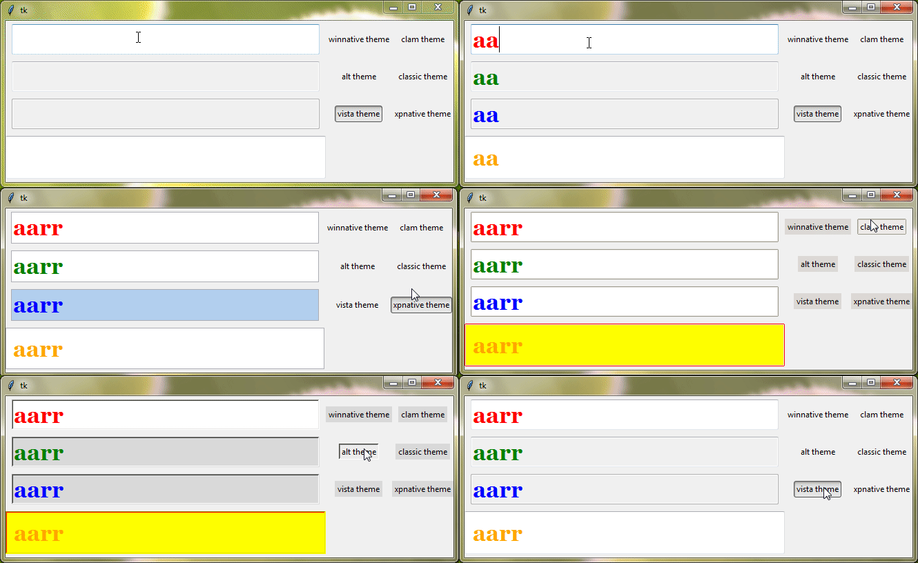
It’s important to note that not all style configuration options apply to every theme.
Example:
from tkinter import *
from tkinter import ttk

root = Tk()

style = ttk.Style()
style.theme_use('clam')

style.configure('design1.TEntry', foreground='green', fieldbackground='lightyellow', bordercolor='red')
style.configure('design2.TEntry', foreground='orange', selectborderwidth=5, selectbackground='hotpink', selectforeground='yellow')

ttk_entry1 = ttk.Entry(root,  font='times 24 bold', width=30, style='design1.TEntry')
ttk_entry1.pack(pady=5)

ttk_entry2 = ttk.Entry(root, font='georgia 24 bold', width=25, style='design2.TEntry')
ttk_entry2.pack(pady=5)

root.mainloop()
Output:

Ttk Entry Appearance Across Themes
Ttk Entry widgets in Tkinter can take on different appearances depending on the theme applied to the GUI. Themes allow you to change the overall look and feel of your Tkinter application, including the appearance of ttk Entry widgets.
Example:
from tkinter import *
from tkinter import ttk

root=Tk()
root.grid_anchor(anchor='center')

style=ttk.Style()

def changetheme():
    themeval=themevar.get()
    style.theme_use(themeval)
    style.configure("design.TEntry", bordercolor='red', foreground='orange', fieldbackground='yellow', padding=10, relief="raised")

themevar=StringVar()
themevar.set("vista")

btn1=ttk.Radiobutton(root,text='winnative theme',value="winnative",command=changetheme,variable=themevar,style='Toolbutton')
btn2=ttk.Radiobutton(root,text='clam theme',value="clam",command=changetheme,variable=themevar,style='Toolbutton')
btn3=ttk.Radiobutton(root,text='alt theme',value="alt",command=changetheme,variable=themevar,style='Toolbutton')
btn4=ttk.Radiobutton(root,text='classic theme',value="classic",command=changetheme,variable=themevar,style='Toolbutton')
btn5=ttk.Radiobutton(root,text='vista theme',value="vista",command=changetheme,variable=themevar,style='Toolbutton')
btn6=ttk.Radiobutton(root,text='xpnative theme',value="xpnative",command=changetheme,variable=themevar,style='Toolbutton')

btn1.grid(row=0,column=2)
btn2.grid(row=0,column=3)
btn3.grid(row=1,column=2)
btn4.grid(row=1,column=3)
btn5.grid(row=2,column=2)
btn6.grid(row=2,column=3)

changetheme()

normal_entry = ttk.Entry(root,  font='georgia 24 bold', width=20, textvariable=new_var, state='normal', foreground='red')
normal_entry.grid(row=0, column=0, pady=5)

readonly_entry = ttk.Entry(root,  font='georgia 24 bold', width=20, textvariable=new_var, state='readonly', foreground='green')
readonly_entry.grid(row=1, column=0, pady=5)

disabled_entry = ttk.Entry(root,  font='georgia 24 bold', width=20, textvariable=new_var, state='disabled', foreground='blue')
disabled_entry.grid(row=2, column=0, pady=5)

stylish_entry = ttk.Entry(root,  font='georgia 24 bold', width=20, textvariable=new_var, style='design.TEntry')
stylish_entry.grid(row=3, column=0, pady=5)

root.mainloop()
Output:
Input Validation for ttk Entry
Suppose, you’re creating a form for users to register on your application. You need them to provide their email address, phone number, and maybe their age. But how do you ensure they enter the right information?
Input validation can help you with that. It checks each piece of information users enter to make sure it’s correct. For example, it can make sure an email address has the right format, a phone number only has digits, or an age is a number within a certain range.
Imagine if someone tried to enter their name instead of an email address in the email field. Input validation would catch that mistake and prompt them to enter a valid email instead. It keeps everything neat, tidy, and error-free.
To implement input validation in your ttk Entry widgets, you can use the validate and validatecommand options.
The validate option tells Tkinter when to check the input in your entry box. And the validatecommand option is where you tell Tkinter how to check the input. You give it a function (or a command) that Tkinter will run whenever it needs to validate the input. This function should return True if the input is okay and False if it’s not.
Example:
In this example, we have an entry box where users type their password. We want to check if the password they enter is at least 8 characters long. If it’s not, we’ll show a message saying the password is weak.
To do this, we’ll use the validate option set to "key" mode. This means the validation happens as the user types each character. Then, we’ll connect a function to the validatecommand option. This function checks the length of the password and updates the entry box’s appearance and message accordingly.
from tkinter import *
from tkinter import ttk

root = Tk()

def check_password_length():
    entry_val = ttk_entry.get()
    if len(entry_val) < 8:
        style.configure('design.TEntry', fieldbackground='pink')
        ttk_label.configure(text='password is weak', foreground='red')
    else:
        style.configure('design.TEntry', fieldbackground='lightgreen')
        ttk_label.configure(text='password is strong enough', foreground='green')
    return True

style = ttk.Style()
style.theme_use('clam')

ttk_entry = ttk.Entry(root, font='georgia 20 bold', show='*', validate='key', validatecommand=check_password_length, style='design.TEntry')
ttk_entry.pack()

ttk_label = ttk.Label(root, text = 'password atleast has 8 characters', font='times 14 bold', background='white', padding=10)
ttk_label.pack()

root.mainloop()
Output:

Most Used Methods
When you’re working with ttk input boxes in Tkinter, there are a few handy methods that you’ll use often.
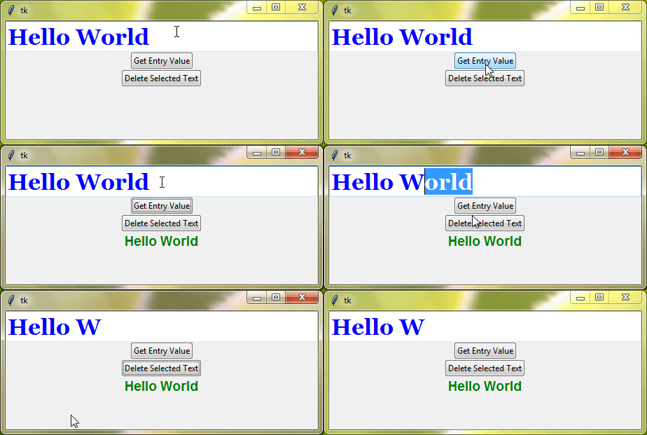
get() | You can use it to grab whatever text the user has entered and use it in your program. |
delete(start,end) | This method removes text from the entry box. You can specify which part of the text you want to delete by providing the starting and ending positions. |
insert(index,text) | It allows you to insert the specified text at the given index position within the entry box. |
Example:
from tkinter import *
from tkinter import ttk

root = Tk()

def get_entry_value():
    entry_val = ttk_entry.get()
    label = ttk.Label(root, text=entry_val, foreground='green', font='arial 14 bold')
    label.pack()

ttk_entry = ttk.Entry(root, font='georgia 24 bold', foreground='blue')
ttk_entry.insert(0, 'Hello')
ttk_entry.insert('end', ' World')
ttk_entry.pack()

get_btn = ttk.Button(root, text='Get Entry Value', command=get_entry_value)
get_btn.pack()

del_btn = ttk.Button(root, text='Delete Selected Text', command=lambda: ttk_entry.delete('sel.first', 'sel.last'))
del_btn.pack()

root.mainloop()
Output:
Here are some other methods of Entry widgets that can also be used with ttk Entry widgets:
icursor()select_range()select_clear()
Bind Events With Your Input Box
When you bind an event to a ttk Entry widget, you’re essentially telling Tkinter to call a function or execute a piece of code whenever that event occurs. For example, you can trigger a function to run whenever the user clicks inside the entry box, presses a key, or moves the mouse over it.
Example:
from tkinter import *
from tkinter import ttk

root = Tk()

def check_integer(event):
    entry_val = ttk_entry.get()
    try:
        if int(entry_val):
            ttk_label.configure(text='Good! Input is an integer', foreground='green')
    except:
            ttk_label.configure(text='Input is not an integer', foreground='red')

ttk_entry = ttk.Entry(root, font='georgia 24 bold', foreground='blue')
ttk_entry.bind('<Return>', check_integer)
ttk_entry.pack()

ttk_label = ttk.Label(root, text = 'Input should be an integer', font='times 14 bold', background='white', padding=10)
ttk_label.pack()

root.mainloop()
Output:

Now, you might be wondering if events are the same as validatecommand. The answer is no, they’re not quite the same. validatecommand is more about checking input when it’s being entered. Events, on the other hand, are broader – they cover a whole range of user actions, giving you the power to respond dynamically as users interact with your input box.



Thanks for excellent info I was looking for this information for my mission.