ttk Radiobuttons in Tkinter
Let’s explore ttk Radiobuttons in Tkinter! Ttk Radiobuttons are like the upgraded version of regular Tkinter Radiobuttons.
As you’re aware, radiobuttons help users pick an option from a list of choices. Ttk Radiobuttons go a step further with their sleek design and modern style that blend better with the overall look of your operating system.
In this ttk Radiobutton tutorial, we’ll teach you how to use these sleek buttons in your Tkinter projects. We’ll cover everything from their features to how to use them effectively.
Building Your First ttk Radiobutton
Radiobuttons are handy for making quizzes, setting panels, choosing preferences, and more. Let’s dive in and create your first ttk Radiobutton!
Example:
from tkinter import *
from tkinter import ttk

root = Tk()
root.title("ttk Radiobutton Tutorial")

# Create a variable to store the selected value
selected_value = StringVar()

# Create ttk Radiobuttons
radiobutton1 = ttk.Radiobutton(root, text="Option 1", variable=selected_value, value="Option 1")
radiobutton2 = ttk.Radiobutton(root, text="Option 2", variable=selected_value, value="Option 2")
radiobutton3 = ttk.Radiobutton(root, text="Option 3", variable=selected_value, value="Option 3")

# Pack the Radiobuttons
radiobutton1.pack()
radiobutton2.pack()
radiobutton3.pack()

root.mainloop()
Output:
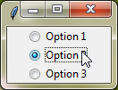
Customizing Options
When working with ttk Radiobuttons, there are a few important customization options you’ll want to know about:
First off, let’s take a look at the text option. This option allows you to set the text displayed next to the radiobutton. It’s what users will see and read to understand the choice they’re making.
Moving on, we have the value option. With this option, we can assign a value to each radiobutton. When a user selects a radiobutton, its corresponding value is stored in a variable.
Now, let’s dive into the variable option. This option is essential as it specifies where the selected value will be stored. This variable is crucial for keeping track of which radiobutton is currently selected.
Lastly, we’ll discuss the command option. With this option, we can define a function to execute when a radiobutton is clicked. This is useful for performing actions or updating other parts of your application based on the radiobutton selection.
Example:
from tkinter import *
from tkinter import ttk

root=Tk()
root.grid_anchor(anchor='center')

def func():
    radio_btn_value=var.get()
    lab=ttk.Label(root,text=f'{radio_btn_value}', background='red', foreground='white', padding=10, font="arial 12 bold")
    lab.grid(row=0, column=1, rowspan=2, padx=15, pady=15)

var=StringVar()

radiobutton1=ttk.Radiobutton(root, text='Radio Button 1', value="Radio button 1 is selected", variable=var, command=func)
radiobutton1.grid(row=0, column=0, padx=10, pady=10)

radiobutton2=ttk.Radiobutton(root, text='Radio Button 2', value="Radio button 2 is selected", variable=var, command=func)
radiobutton2.grid(row=1, column=0, padx=10, pady=10)

root.mainloop()
Output:
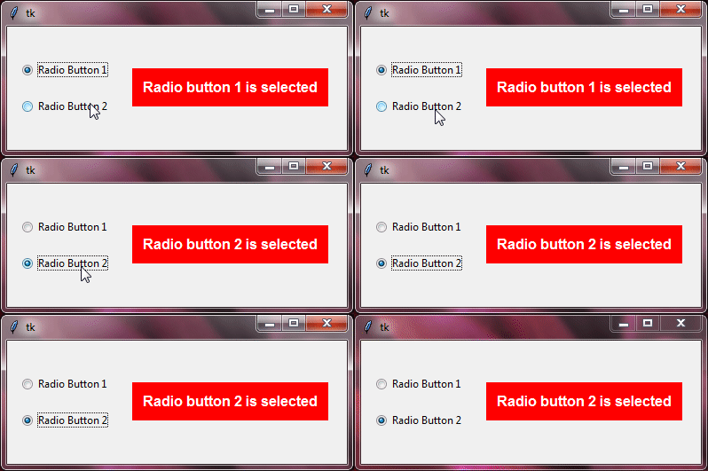
Additional Standard Options Available for Use:
cursorstatestyletakefocustextvariableunderlinewidth
For a deeper understanding of these options, explore the Tkinter Standard Options and ttk and ttk style.
Ttk Radiobuttons with Images
Adding images to radiobuttons can make them more visually appealing and easier for users to understand. Instead of just text, you can use pictures to show options.
To do this, you can use the compound option. This lets you decide how the image and text should be arranged together. You can choose to have the image on the left, right, top, or bottom of the text.
You’ll also use the image option to add an image to each radiobutton. This image will show up next to the text, based on how you’ve set up the compound option.
Example:
from tkinter import *
from tkinter import ttk

root=Tk()
root.grid_anchor(anchor='center')

image=PhotoImage(file='HOME.png')

def func():
    radio_btn_value=var.get()
    lab=ttk.Label(root,text=f'{radio_btn_value}', background='red', foreground='white', padding=10, font="arial 12 bold")
    lab.grid(row=0, column=1, rowspan=3, padx=30, pady=15)

var=StringVar()

radiobutton1=ttk.Radiobutton(root, text="Radio button 1", value='Radiobutton with only text is selected', variable=var,  image=image, compound="text", command=func)
radiobutton1.grid(row=0, column=0, padx=10, pady=10)

radiobutton2=ttk.Radiobutton(root, text="Radio button 2", value='Radiobutton with only image is selected', variable=var,  image=image, compound="image", command=func)
radiobutton2.grid(row=1, column=0, padx=10, pady=10)

radiobutton3=ttk.Radiobutton(root, text="Radio button 3", value='Radiobutton with text and image is selected', variable=var,  image=image, compound="top", command=func)
radiobutton3.grid(row=2, column=0, padx=10, pady=10)

root.mainloop()
Output:

Styling ttk Radiobuttons
When it comes to customizing the appearance of ttk Radiobuttons, we can use the ttk style to achieve the desired look. The class name we use to style ttk Radiobuttons is called "TRadiobutton".
By defining a ttk style with the class name "TRadiobutton", we can tweak things like colors, fonts, and spacing to make the radiobuttons fit better with our app’s design.
Example:
from tkinter import *
from tkinter import ttk

root = Tk()
root.title("ttk Radiobutton Customize Default Style")

style = ttk.Style()
style.configure("TRadiobutton", foreground="white", padding=20, background="red", font="georgia 20 bold")

# Create a variable to store the selected value
selected_value = StringVar()

# Create ttk Radiobuttons
radiobutton1 = ttk.Radiobutton(root, text="Option 1", variable=selected_value, value="Option 1")
radiobutton2 = ttk.Radiobutton(root, text="Option 2", variable=selected_value, value="Option 2")
radiobutton3 = ttk.Radiobutton(root, text="Option 3", variable=selected_value, value="Option 3")

# Pack the Radiobuttons
radiobutton1.pack(pady=5)
radiobutton2.pack(pady=5)
radiobutton3.pack(pady=5)

root.mainloop()
Output:
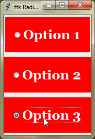
Style Configuration Options
Let’s explore some commonly used style configuration options for ttk radiobutton.
foreground | Determines the color of the text displayed on the radiobutton. |
background | Sets the background color of the radiobutton. |
padding | Space between the text or image and the border of the radiobutton. |
font | Specifies the font style, size, and weight of the text displayed. |
indicatorbackground | It determines the background color of the radiobutton indicator, which is the small circle or square that shows the selected state. |
indicatormargin | Space between the indicator and the text or image within the radiobutton. |
Depending on the theme you’re using, some options may have no effect or may behave differently.
Style Specific Radiobuttons
Now, let’s talk about how to style specific ttk Radiobuttons with custom class names!
When you want to give a unique look to certain radiobuttons, you can create custom class names for them. These class names help you apply specific styles to individual radiobuttons or groups of radiobuttons.
You can create custom class names like this "design1.TRadiobutton" and "design2.TRadiobutton". Then, you can define different styles for each custom class name.
After that, by using the style parameter, you can apply these styles to the ttk radiobuttons.
Example:
from tkinter import *
from tkinter import ttk

root=Tk()
root.grid_anchor(anchor='center')

image=PhotoImage(file='HOME.png')

style=ttk.Style()
style.theme_use("clam")

style.configure('design1.TRadiobutton', background='green', foreground='white', padding=15, font="arial 20 bold", indicatorbackground='orange', indicatormargin=30)
style.configure('design2.TRadiobutton', background='red', padding=15, image=image, indicatorbackground='yellow', indicatormargin=30)

def func():
    radio_btn_value=var.get()
    lab=ttk.Label(root,text=f'{radio_btn_value}', background='red', foreground='white', padding=10, font="georgia 16 bold")
    lab.grid(row=0, column=1, rowspan=2, padx=30, pady=15)

var=StringVar()

radiobutton1=ttk.Radiobutton(root,text='Radiobutton1', variable=var, value="Radio button without image is selected", style='design1.TRadiobutton', width=20, command=func)
radiobutton1.grid(row=0,column=0)

radiobutton2=ttk.Radiobutton(root,text='Radiobutton2', variable=var, value="Radio button with image is selected", style='design2.TRadiobutton', width=20, command=func)
radiobutton2.grid(row=1,column=0)

root.mainloop()
Output:

Designing ttk Radiobuttons for Toolbars
When we want our ttk Radiobuttons to look like toolbar buttons, we use the "Toolbutton" class name in ttk style. This class name helps us apply specific styling to make the radiobuttons look like they belong on a toolbar.
Example:
from tkinter import *
from tkinter import ttk
root=Tk()
root.grid_anchor(anchor='center')

image=PhotoImage(file='HOME.png')

style=ttk.Style()

style.map('design1.Toolbutton', background=[('selected', 'white'), ('active','orange'), ('!disabled','red')], foreground=[('selected', 'red'), ('active','lightyellow'), ('!disabled','white')], font=[('!disabled','arial 16 bold')])
style.map('design2.Toolbutton', background=[('selected', 'white'), ('active','orange'), ('!disabled','blue')], foreground=[('selected', 'blue'), ('active','lightyellow'), ('!disabled','white')], font=[('!disabled','arial 16 bold')])
style.map('design3.Toolbutton',background=[('selected', 'green'), ('active','red'),('!disabled',"yellow")],foreground=[('selected', 'white'), ('active','white'),('!disabled',"red")], font=[('!disabled','georgia 16 bold')])

def func():
    radio_btn_value=var.get()
    lab=ttk.Label(root,text=f'{radio_btn_value}', background='red', foreground='white', padding=10, font="georgia 16 bold")
    lab.grid(row=0, column=1, rowspan=4, padx=50, pady=15)

var=StringVar()

radiobutton1=ttk.Radiobutton(root, text='Radiobutton1', command=func, variable=var, value="Simple Radiobutton is selected", style='Toolbutton', width=20)
radiobutton1.grid(row=0, column=0, padx=15, pady=15)

radiobutton2=ttk.Radiobutton(root, text='Radiobutton2', command=func, variable=var, value="Red Radiobutton is selected", style='design1.Toolbutton', width=20, padding=20)
radiobutton2.grid(row=1, column=0, padx=15, pady=15)

radiobutton3=ttk.Radiobutton(root, text='Radiobutton3', command=func, variable=var, value="Blue Radiobutton is selected", style='design2.Toolbutton', width=20, padding=20)
radiobutton3.grid(row=2, column=0, padx=15, pady=15)

radiobutton4=ttk.Radiobutton(root, text='Radiobutton4', command=func, image=image, variable=var, value="Radiobutton with image is selected", style='design3.Toolbutton', compound="top")
radiobutton4.grid(row=3, column=0, padx=15, pady=15)

root.mainloop()
Output:
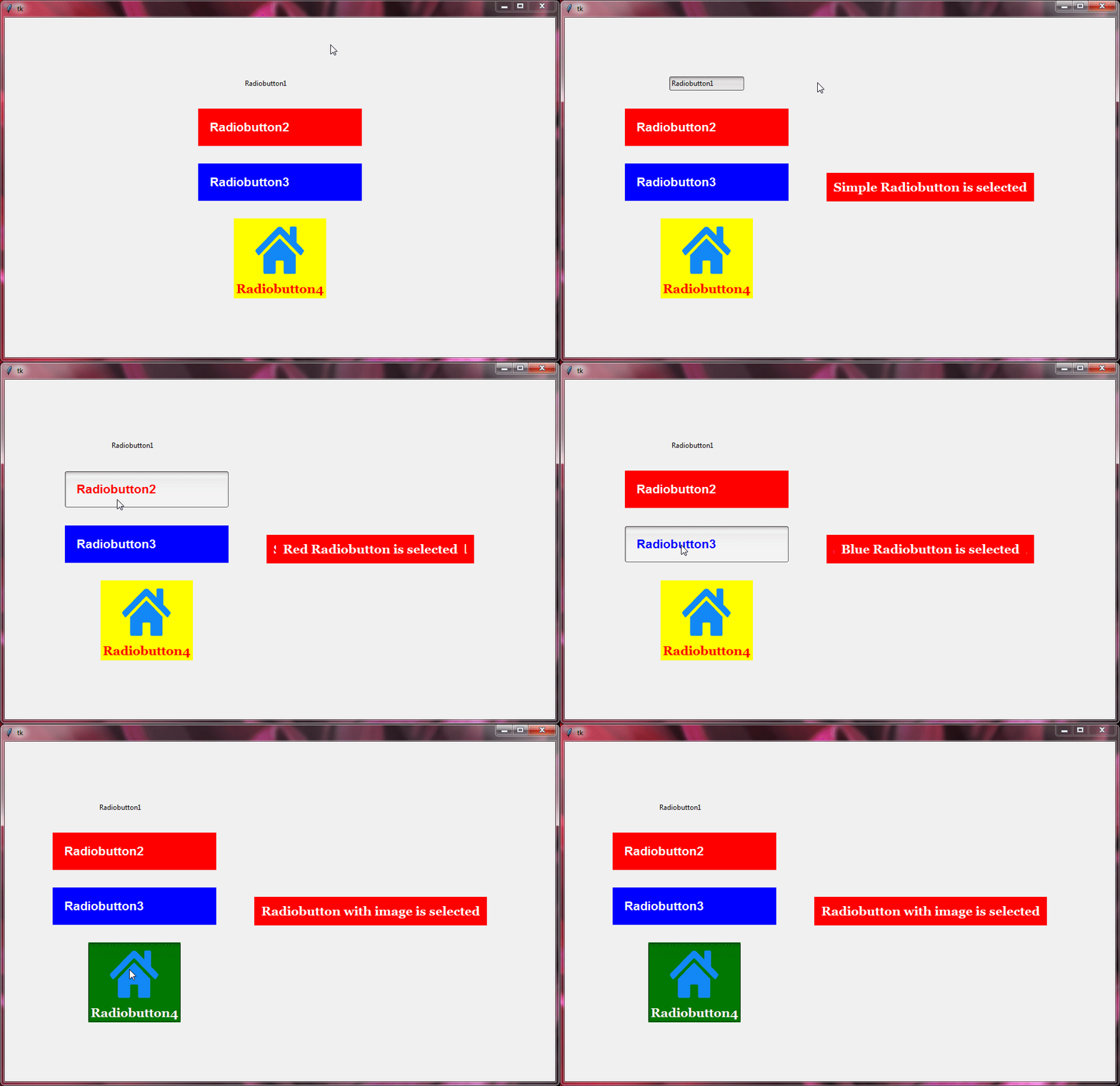
Different Looks of ttk Radiobuttons
By trying out different themes, you can see how the radiobuttons appearance changes. Some themes might make them look modern, while others may give them a classic or simple look.
Example:
from tkinter import *
from tkinter import ttk

root=Tk()
root.grid_anchor(anchor='center')

image=PhotoImage(file='HOME.png')

style=ttk.Style()

def changetheme():
    themeval=themevar.get()
    style.theme_use(themeval)

themevar=StringVar()
themevar.set("vista")

btn1=Radiobutton(root,text='winnative theme',value="winnative",command=changetheme,variable=themevar)
btn2=Radiobutton(root,text='clam theme',value="clam",command=changetheme,variable=themevar)
btn3=Radiobutton(root,text='alt theme',value="alt",command=changetheme,variable=themevar)
btn4=Radiobutton(root,text='classic theme',value="classic",command=changetheme,variable=themevar)
btn5=Radiobutton(root,text='vista theme',value="vista",command=changetheme,variable=themevar)
btn6=Radiobutton(root,text='xpnative theme',value="xpnative",command=changetheme,variable=themevar)

btn1.grid(row=0,column=2)
btn2.grid(row=1,column=2)
btn3.grid(row=2,column=2)
btn4.grid(row=3,column=2)
btn5.grid(row=0,column=3)
btn6.grid(row=1,column=3)

changetheme()

var=IntVar()

radiobutton1=ttk.Radiobutton(root, text='Radio Button 1', value=1, variable=var)
radiobutton1.grid(row=0, column=0, padx=10, pady=10)

radiobutton2=ttk.Radiobutton(root, text='Radiobutton2', value=2, variable=var, image=image, width=20)
radiobutton2.grid(row=1, column=0, padx=15, pady=15)

radiobutton3=ttk.Radiobutton(root, text='Radiobutton3', value=3, variable=var, width=20, compound='text', style='Toolbutton')
radiobutton3.grid(row=2, column=0, padx=15, pady=15)

radiobutton4=ttk.Radiobutton(root, text='Radiobutton4', value=4, variable=var, image=image, compound="top", style='Toolbutton')
radiobutton4.grid(row=3, column=0, padx=15, pady=15)

root.mainloop()
Output:

Event Binding for Interactive Radiobuttons
Tkinter lets you attach events to Radiobuttons, so when a user selects an option, you can trigger a specific function or action.
For example, in a quiz app, you could check if the selected answer is correct as soon as the user picks it. It adds a fun, interactive element to your app.
Example:
from tkinter import *
from tkinter import ttk

root = Tk()
root.title("ttk Radiobutton Tutorial")

# Create a variable to store the selected value
selected_value = StringVar()

# Create ttk Radiobuttons
radiobutton1 = ttk.Radiobutton(root, text="Option 1", variable=selected_value, value="Option 1")
radiobutton2 = ttk.Radiobutton(root, text="Option 2", variable=selected_value, value="Option 2")

# Pack the Radiobuttons
radiobutton1.pack()
radiobutton2.pack()

# Function to print the selected option
def print_selected_option(event):
    label = ttk.Label(root, text=f"Selected option: {selected_value.get()}")
    label.pack()

# Bind the event to the callback function
radiobutton1.bind("<Button-1>", print_selected_option)
radiobutton2.bind("<Button-1>", print_selected_option)


root.mainloop()
Output:

Conclusion
To sum it up, we’ve learned all about ttk Radiobuttons in Tkinter. We covered the basics and even dived into more advanced topics like styling and handling events. I hope you’ve enjoyed learning about ttk Radiobuttons and feel ready to use them in your projects.
