ttk Checkbuttons
A ttk checkbutton in Tkinter is a small box that you can tick or untick. It’s useful for letting users pick between two choices, such as “Yes” or “No”, “On” or “Off”. Although they function similarly to regular checkbuttons in Tkinter, ttk checkbuttons have a more modern appearance and blend in better with your operating system.
In this guide, we’ll cover all you need to know about using ttk checkbuttons in Tkinter. We’ll start with the basics, showing you how to create them. Then, we’ll explain how to change their appearance to fit your style. Finally, we’ll teach you how to put them in toolbars for easy access.
Creating Your First ttk Checkbutton
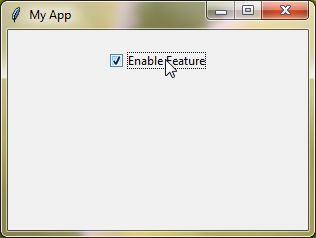
Let’s start with a simple example of creating a ttk Checkbutton:
from tkinter import *
from tkinter import ttk

# Create the main application window
root = Tk()
root.title("My App")
root.geometry("300x200")

# Create a variable to store the Checkbutton's state
check_var = BooleanVar()

# Create a ttk Checkbutton
check_button = ttk.Checkbutton(root, text="Enable Feature", variable=check_var, onvalue=True, offvalue=False)
check_button.pack(pady=20)

# Start the main event loop
root.mainloop()
Output:
Customizing ttk Checkbuttons
Ttk Checkbuttons, being a modern version of Tkinter Checkbuttons, offer the same familiar options.
text
The text option lets you choose the words displayed next to your checkbutton. It helps users understand what each option means. For example, you could use “Enable” and “Disable” to show different states.
onvalue and offvalue
With the onvalue and offvalue options, you can pick what values the checkbutton represents when it’s checked or unchecked. These values can be numbers, words, or anything else you need. For instance, you might use 1 for onvalue and 0 for offvalue if you’re dealing with simple yes/no choices.
variable
The variable option connects the checkbutton to a Tkinter variable. This variable keeps track of the checkbutton’s current state, making it easy to use in your code. It’s a convenient way to keep track of the checkbutton’s status.
command
With the command option, you can specify a function that runs whenever the checkbutton is clicked. This function can do anything you want, like updating other parts of your program or performing specific tasks based on the checkbutton’s status. It’s a handy way to make your program more interactive.
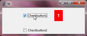
Example:
from tkinter import *
from tkinter import ttk
root=Tk()
root.grid_anchor(anchor='center')

# Checkbutton functions
def func1():
    chk_btn_value=var1.get()
    lab=ttk.Label(root,text=f'{chk_btn_value}', background='red', foreground='white', padding=10, font="arial 12 bold")
    lab.grid(row=0, column=1, padx=15, pady=15)

def func2():
    chk_btn_value=var2.get()
    lab=ttk.Label(root, text=f'{chk_btn_value}', background='blue', foreground='white', padding=10, font="arial 12 bold")
    lab.grid(row=1, column=1, padx=15, pady=15)

# ttk Checkbutton 1 with integer variable
var1=IntVar()
checkbutton1=ttk.Checkbutton(root,text='Checkbutton1',variable=var1,command=func1)
checkbutton1.grid(row=0, column=0, padx=10, pady=10)

# ttk Checkbutton 2 with string variable
var2=StringVar()
checkbutton2=ttk.Checkbutton(root,text='Checkbutton2',onvalue="The value is on",offvalue="The value is off",variable=var2,command=func2)
checkbutton2.grid(row=1, column=0, padx=10, pady=10)

root.mainloop()
Output:
Additional Standard Options Available for Use:
compoundcursorimagestatestyletakefocustexttextvariableunderlinewidth
For a deeper understanding of these options, explore the Tkinter Standard Options and ttk and ttk style.
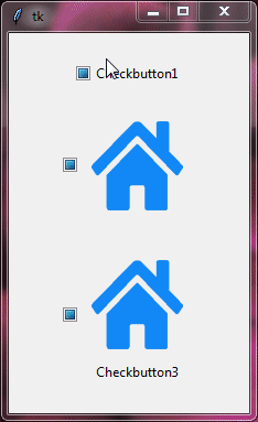
Enhancing Checkbuttons with Images
To make your Checkbuttons more visually appealing, you can use images. First, create PhotoImage objects from image files. Then, simply assign these images to the image option of your ttk Checkbutton.
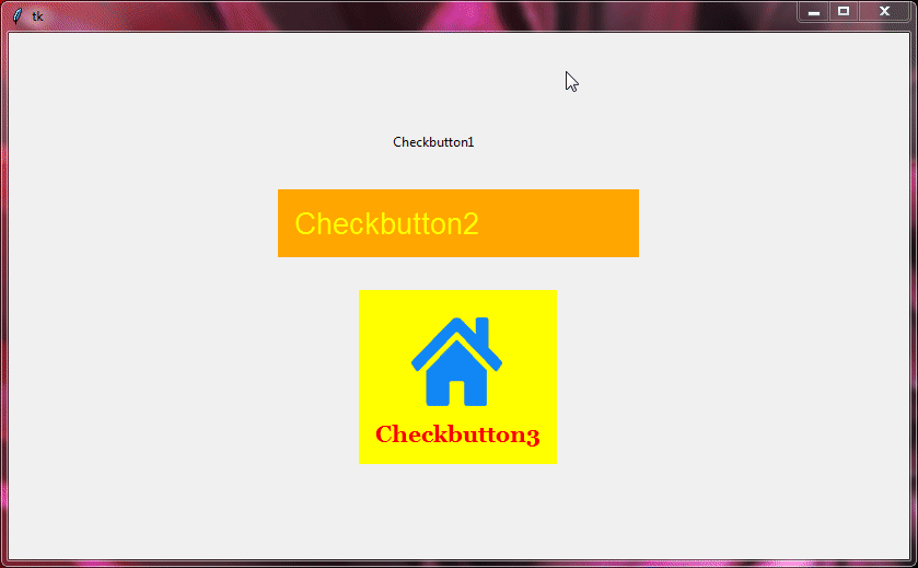
Example:
from tkinter import *
from tkinter import ttk

root=Tk()
root.grid_anchor(anchor='center')

image=PhotoImage(file='HOME.png')

checkbutton1=ttk.Checkbutton(root,text='Checkbutton1', image=image, compound="text")
checkbutton1.grid(row=0, column=0, padx=10, pady=10)

checkbutton2=ttk.Checkbutton(root,text='Checkbutton2', image=image, compound="image")
checkbutton2.grid(row=1, column=0, padx=10, pady=10)

checkbutton3=ttk.Checkbutton(root,text='Checkbutton3', image=image, compound="top")
checkbutton3.grid(row=2, column=0, padx=10, pady=10)

root.mainloop()
Output:
Styling ttk Checkbuttons
You can easily style ttk checkbuttons using ttk style. The class name for ttk checkbuttons is "TCheckbutton", which allows us to customize their appearance to match our design preferences.
Style Configuration Options
When styling ttk checkbuttons, you have several configuration options at your disposal to tailor their appearance to your liking:
foreground | Sets the color of the text displayed on the checkbutton. |
background | Specifies the background color of the checkbutton. |
padding | Adjusts the space between the text and the edges of the checkbutton. |
indicatorbackground | Sets the color of the indicator (the box or circle that shows whether the checkbutton is selected). |
indicatormargin | Determines the space between the indicator and the text within the checkbutton. |
font | Allows you to set the font style, size, and other properties for the text displayed on the checkbutton. |
Depending on your theme, some options may not have any effect.
Example:
from tkinter import *
from tkinter import ttk

root = Tk()

# Create a ttk Checkbutton with custom foreground color
style = ttk.Style()
style.configure("TCheckbutton", foreground="white", padding=20, background="green", font="georgia 20 bold")

check_button1 = ttk.Checkbutton(root, text="Option 1")
check_button1.pack(pady=5)

check_button2 = ttk.Checkbutton(root, text="Option 2")
check_button2.pack(pady=5)

root.mainloop()
Output:

Style Specific ttk Checkbuttons with Custom Class Names
To style specific ttk checkbuttons differently, you can use custom class names. These names help you target particular checkbuttons for individualized styling.
Here’s how:
First, decide on unique class names for the checkbuttons you want to style differently, such as "design.TCheckbutton", "special.TCheckbutton", or "unique.TCheckbutton".
Then, using ttk style, customize the appearance of each class name using style configuration options.
Finally, apply these custom styles to the corresponding checkbuttons. By setting the style option of each checkbutton widget to its specific custom class name, you ensure that each checkbutton gets its unique design.
Here’s an example of how you can style specific checkbuttons:
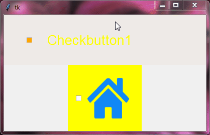
Example:
from tkinter import *
from tkinter import ttk

root=Tk()
root.grid_anchor(anchor='center')

image=PhotoImage(file='HOME.png')

style=ttk.Style()
style.theme_use("clam")

style.configure('design1.TCheckbutton',background='red',foreground='yellow',padding=15,font="arial 20", indicatorbackground='orange',indicatormargin=30)
style.configure('design2.TCheckbutton',background='yellow',padding=15,image=image)

checkbutton1=ttk.Checkbutton(root,text='Checkbutton1', style='design1.TCheckbutton', width=20, compound='text')
checkbutton1.grid(row=0,column=0)

checkbutton2=ttk.Checkbutton(root,text='Checkbutton2', style='design2.TCheckbutton', width=20)
checkbutton2.grid(row=1,column=0)

root.mainloop()
Output:
Designing ttk Checkbuttons for Toolbars
When it comes to crafting ttk checkbuttons specifically for toolbars, utilizing the "Toolbutton" class name can be helpful. This unique class name allows you to tailor the appearance of your checkbuttons to seamlessly integrate them into toolbar layouts.
Here’s how you can create ttk Checkbuttons for your toolbar.
Example:
from tkinter import *
from tkinter import ttk

root=Tk()
root.grid_anchor(anchor='center')

image=PhotoImage(file='HOME.png')

style=ttk.Style()

style.configure('design1.Toolbutton',background='orange',foreground='yellow',padding=15,font="arial 20", indicatorbackground='orange',indicatormargin=30)

style.configure('design2.Toolbutton', padding=15, image=image, font="georgia 16 bold")
style.map('design2.Toolbutton',background=[('selected', 'green'), ('active','red'),('!disabled',"yellow")],foreground=[('selected', 'white'), ('active','white'),('!disabled',"red")])

# checkbutton functions
def func1():
    chk_btn_value=var1.get()
    lab=ttk.Label(root,text=f'{chk_btn_value}',background='yellow',foreground='black',padding=15,font="arial 12 bold")
    lab.grid(row=0,column=1)

def func2():
    chk_btn_value=var2.get()
    lab=ttk.Label(root,text=f'{chk_btn_value}',background='yellow',foreground='black',padding=15,font="arial 12 bold")
    lab.grid(row=1,column=1)

def func3():
    chk_btn_value=var3.get()
    lab=ttk.Label(root,text=f'{chk_btn_value}',background='yellow',foreground='black',padding=15,font="arial 12 bold")
    lab.grid(row=2,column=1)

var1=StringVar()
checkbutton1=ttk.Checkbutton(root, text='Checkbutton1', command=func1, variable=var1, onvalue="Checkbutton1 is selected", offvalue="Checkbutton1 is not selected", style='Toolbutton', width=20)
checkbutton1.grid(row=0, column=0, padx=15, pady=15)

var2=StringVar()
checkbutton2=ttk.Checkbutton(root, text='Checkbutton2', command=func2, variable=var2, onvalue="Checkbutton2 is selected", offvalue="Checkbutton2 is not selected", style='design1.Toolbutton', width=20, compound='text')
checkbutton2.grid(row=1, column=0, padx=15, pady=15)

var3=StringVar()
checkbutton3=ttk.Checkbutton(root, text='Checkbutton3', command=func3, variable=var3, onvalue="Checkbutton3 is selected", offvalue="Checkbutton3 is not selected", style='design2.Toolbutton', compound="top")
checkbutton3.grid(row=2, column=0, padx=15, pady=15)

root.mainloop()
Output:
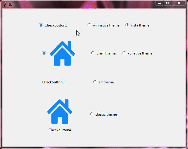
Toggling Checkbuttons Across Themes
Now, let’s take a look at how checkbuttons appear with different themes.
To see the effect of different themes on ttk checkbuttons, you can experiment with themes like “clam”, “alt”, “default”, “classic”, and “vista”.
Example:
from tkinter import *
from tkinter import ttk

root=Tk()
root.grid_anchor(anchor='center')

image=PhotoImage(file='HOME.png')

style=ttk.Style()

def changetheme():
    themeval=themevar.get()
    style.theme_use(themeval)

themevar=StringVar()
themevar.set("vista")

btn1=Radiobutton(root,text='winnative theme',value="winnative",command=changetheme,variable=themevar)
btn2=Radiobutton(root,text='clam theme',value="clam",command=changetheme,variable=themevar)
btn3=Radiobutton(root,text='alt theme',value="alt",command=changetheme,variable=themevar)
btn4=Radiobutton(root,text='classic theme',value="classic",command=changetheme,variable=themevar)
btn5=Radiobutton(root,text='vista theme',value="vista",command=changetheme,variable=themevar)
btn6=Radiobutton(root,text='xpnative theme',value="xpnative",command=changetheme,variable=themevar)

btn1.grid(row=0,column=2)
btn2.grid(row=1,column=2)
btn3.grid(row=2,column=2)
btn4.grid(row=3,column=2)
btn5.grid(row=0,column=3)
btn6.grid(row=1,column=3)

changetheme()

checkbutton1=ttk.Checkbutton(root, text='Checkbutton1', width=20)
checkbutton1.grid(row=0, column=0, padx=15, pady=15)

checkbutton2=ttk.Checkbutton(root, text='Checkbutton2', image=image, width=20)
checkbutton2.grid(row=1, column=0, padx=15, pady=15)

checkbutton3=ttk.Checkbutton(root, text='Checkbutton3', width=20, compound='text', style='Toolbutton')
checkbutton3.grid(row=2, column=0, padx=15, pady=15)

checkbutton4=ttk.Checkbutton(root, text='Checkbutton4', image=image, compound="top", style='Toolbutton')
checkbutton4.grid(row=3, column=0, padx=15, pady=15)

root.mainloop()
Output:
Event Binding with ttk Checkbuttons
Event binding allows you to associate actions with checkbuttons, triggering specific functions or responses when they are clicked or toggled. Here’s how you can use event binding with ttk checkbuttons.
from tkinter import *
from tkinter import ttk

def on_checkbutton_click():
    if check_var.get():
        label = ttk.Label(root, text="Checkbutton is checked!")
        label.pack()
    else:
        label = ttk.Label(root, text="Checkbutton is unchecked!")
        label.pack()

root = Tk()
root.title("Event Binding Example")
root.geometry("300x200")

check_var = BooleanVar()

check_button = ttk.Checkbutton(root, text="Click me!", variable=check_var)
check_button.pack(pady=20)

check_button.bind("<Button-1>", lambda event: on_checkbutton_click())

root.mainloop()
Output:
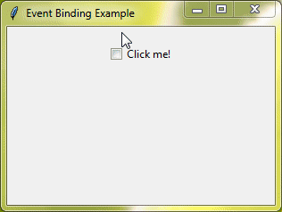
In this example, we created a simple function on_checkbutton_click() that prints a message based on the Checkbutton’s state. We then used the bind() method to connect the "<Button-1>" event (which means a left mouse click) to our function.
When you run this code and click the Checkbutton, it will display "Checkbutton is checked!" if it’s checked and "Checkbutton is unchecked!" if it’s unchecked. You can bind other events as well, like "<Enter>" (when the mouse pointer enters the Checkbutton), "<Leave>" (when the mouse pointer leaves the Checkbutton), or "<Return>" (when the user presses the Enter key).
Conclusion
Great job! You’ve finished this tutorial on ttk Checkbuttons in Tkinter. Now, you can create, style, and improve your checkbuttons with images, custom styles, and themes. Keep exploring and trying out new things to develop impressive and user-friendly GUI applications.