ttk and ttk Style
Welcome to the ttk (themed Tkinter) and ttk style tutorial!
Here, we’ll learn about ttk widgets, which are upgraded versions of regular Tkinter widgets. We’ll talk about stuff like widget elements (basically, the parts that make up a widget) and themes (which control how widgets look and act).
Then, we’ll learn about ttk style, which lets you customize how ttk widgets appear. We’ll cover how to use existing styles, tweak them to fit your needs, and even create your custom styles.
We’ll also explore how to use themes, adjust styles based on conditions, and make your unique themes.
But first, let’s understand what ttk is all about in Tkinter.
What is ttk in Tkinter and ttk Widgets?
TTK, short for themed Tkinter, is an extension module in Tkinter that provides a set of themed widgets. These widgets offer a more modern and consistent look across different platforms compared to the standard Tkinter widgets. TTK widgets are designed to blend seamlessly with the native appearance of the user’s operating system, resulting in a more polished and professional GUI (Graphical User Interface) for your applications.
TTK widgets include buttons, labels, entry fields, comboboxes, progress bars, and more. They offer enhanced functionality and customization options, making them a preferred choice for building sleek and visually appealing user interfaces.
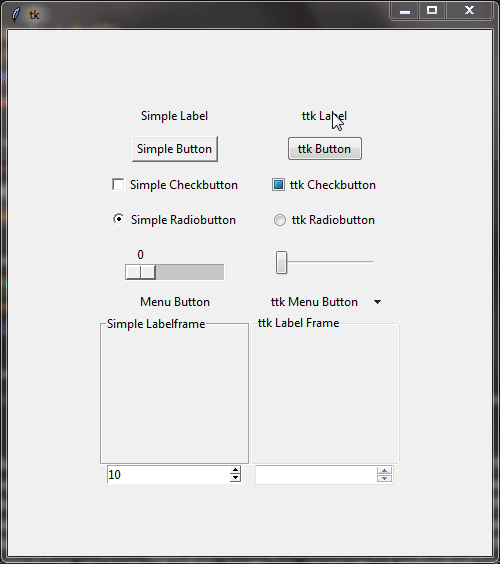
Understanding ttk Concepts: Elements, Layouts, Themes
Think of elements as the different parts of a widget, like the text, border, or background of a button. With ttk, you can customize each part separately to make your widgets look just right.
Layouts are like the instructions for how these elements should be arranged within a widget. They tell the widget where to put each part and how big it should be, so everything looks neat and organized.
Themes are like a set of design rules for your widgets. When you apply a theme, it changes how all your widgets look, making them match each other and giving your whole app a consistent style. Tkinter comes with built-in themes like “clam,” “default,” “vista,” and more.
What is ttk Style and How to Use It
In Tkinter, ttk style is like a toolkit for making your buttons, labels, and other widgets look modern. But how does it work, and how can you use it in your projects? Let’s break it down.
Tkinter already comes with lots of widgets you can use to build your app, like buttons and text boxes. But sometimes, they can look a bit old-fashioned. That’s where ttk (themed Tkinter) comes in. It offers fancier widgets that look sleek and cool. And ttk style lets you customize how these widgets look even more. You can change things like colors, fonts, and borders to make your app look just how you want it.
Using ttk style is pretty easy. Here’s how:
Just like you import Tkinter, you’ll also import ttk in your Python code.
import tkinter as tk
from tkinter import ttk
Next, you’ll make a style object that you’ll use to tweak how your widgets look.
root = tk.Tk()
style = ttk.Style()
Now, you can use this style object to change the appearance of specific widgets and besides customizing individual widget styles, you can also use handy functions provided by ttk style to enhance the overall appearance of your application. We’ll cover these functions in the upcoming sections.
Using ttk Themes
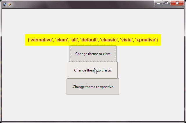
To pick a style theme for our GUI, we need to know what themes we have to choose from. We can do this with the theme_names() method. It gives us a list of all the available themes.
Once we’ve found a theme we like, we can set it for our GUI using the theme_use() method. We just need to pass the name of the theme we want as an argument.
Example :
from tkinter import *
from tkinter import ttk

root=Tk()
root.grid_anchor('center')

style=ttk.Style()

label=ttk.Label(root,text=f"{style.theme_names()}",background='yellow',foreground="brown",font="Arial 12 bold",padding=8)
label.grid(row=0,column=0)

btn1 = ttk.Button(root, text="Change theme to clam", padding=18, command=lambda :style.theme_use("clam"))
btn1.grid(row=1, column=0)

btn2 = ttk.Button(root, text="Change theme to classic", padding=18, command=lambda :style.theme_use("classic"))
btn2.grid(row=2, column=0)

btn3 = ttk.Button(root, text="Change theme to xpnative", padding=18, command=lambda :style.theme_use("xpnative"))
btn3.grid(row=3, column=0)

root.mainloop()
Output :
Methods for Theme Elements in Tkinter
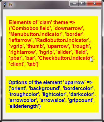
When we use the element_names()
Now, if we want to know more about a specific element from that list, we can use the element_options()
Example :
from tkinter import *
from tkinter import ttk

root=Tk()
root.grid_anchor('center')

style=ttk.Style()
style.theme_use('clam')

# label1 is showing the use of the element_names() of the ttk.Style()
label1=ttk.Label(root,text=f"Elements of 'clam' theme => {style.element_names()}",background='yellow',foreground="red",font="Arial 12 bold",padding=8,wraplength=300)
label1.grid(row=0,column=0,pady=10)

# label2 is showing the use of the element_options() of the ttk.Style()
label2=ttk.Label(root,text=f"Options of the element 'uparrow' => {style.element_options('uparrow')}",background='yellow',foreground="blue",font="Arial 12 bold",padding=8,wraplength=300)
label2.grid(row=1,column=0,pady=10)

root.mainloop()
Output :
Configuring ttk Style
Get ready to take your GUI design to the next level with ttk.style().configure(). This powerful method allows you to style your ttk widgets.
But before we learn how to use configure(), let’s first understand something called class names of ttk widgets. Class names are like labels that help us identify and style different types of ttk widgets.
For example, ttk button widget has a class name "TButton" while the class name of ttk Label is "TLabel". These class names act as shortcuts for styling, making it easier to apply changes to specific types of widgets.
Understanding class names is essential because it allows us to target and style ttk widgets precisely the way we want.
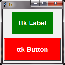
Example :
from tkinter import *
from tkinter import ttk

root=Tk()
root.grid_anchor('center')

style=ttk.Style()
style.theme_use('alt')

style.configure("design.TButton",background="red",foreground="white",font="Arial 16 bold", padding=20)
style.configure("design.TLabel",background="green",foreground="white",font="Arial 16 bold", padding=20)

label=ttk.Label(root,text = f"ttk Label", style = "design.TLabel")
label.grid(row=0,column=0,pady=10)

button=ttk.Button(root,text = "ttk Button", style = "design.TButton")
button.grid(row=1,column=0,padx=5,pady=5)

root.mainloop()
Output :
ttk Style Mapping
In Tkinter’s ttk module, the ttk.style().map() function is a powerful tool for customizing the appearance of ttk widgets based on different states or conditions. This means you can specify how a widget should look when it’s in a particular state, such as normal, active, or disabled.
For instance, if you want a button to turn blue when it’s active and gray when it’s disabled, you’d write something like this:
style = ttk.Style()
style.map("TButton", foreground=[('active', 'blue'), ('disabled', 'gray')])
This tells Tkinter that when the button is active (when the mouse is over it), it should show blue text. And when it’s disabled, it should show gray text.
Now, let’s create a complete example to see how we can use the ttk.Style().map() in Tkinter’s ttk module to create custom button designs.
Example :
from tkinter import *
from tkinter import ttk

root=Tk()
root.grid_anchor('center')

style=ttk.Style()

style.theme_use('clam')

style.map("design1.TButton",background=[("pressed","red"),("active","blue"), ("!disabled","skyblue")],foreground=[("pressed","white"),("active","yellow")],font=[("pressed","Arial 14 bold"),("active","Georgia 12 bold")])
style.map("design2.TButton",background=[("pressed","green"),("active","red"), ("!disabled","lightyellow")],foreground=[("pressed","yellow"),("active","white")],font=[("pressed","times 14 bold"),("active","Georgia 16 bold")])

button1 =ttk.Button(root,text = "ttk Button 1", style = "design1.TButton", padding=20, width=30)
button1.grid(row=0,column=0,padx=5,pady=5)

button2 =ttk.Button(root,text = "ttk Button 2", style = "design2.TButton", padding=20, width=30)
button2.grid(row=1,column=0,padx=5,pady=5)

root.mainloop()
Output :

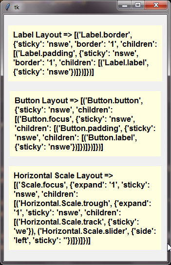
Power of lookup() and layout()
The layout() function is really handy when we want to know how a ttk widget is put together, like what parts it’s made of and how they’re arranged. When you use the layout() function, it gives you a list of pairs of information, where each pair tells you about one part of the widget’s layout.
Example :
from tkinter import *
from tkinter import ttk

root=Tk()
root.grid_anchor('center')

style=ttk.Style()

label1=ttk.Label(root,text=f"Label Layout => {style.layout('TLabel')}", background='lightyellow', foreground="black", font="Arial 12 bold", padding=8, wraplength=300)
label1.grid(row=0,column=0, pady=10)

label2=ttk.Label(root,text=f"Button Layout => {style.layout('TButton')}", background='lightyellow', foreground="black", font="Arial 12 bold", padding=8, wraplength=300)
label2.grid(row=1,column=0, pady=10)

label3=ttk.Label(root,text=f"Horizontal Scale Layout => {style.layout('Horizontal.TScale')}", background='lightyellow', foreground="black", font="Arial 12 bold", padding=8, wraplength=300)
label3.grid(row=2,column=0, pady=10)

root.mainloop()
Output :
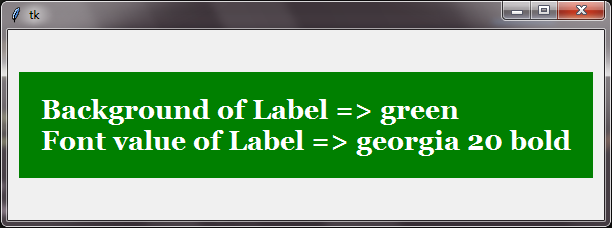
When we want to know the current value of a specific style option for a ttk widget, we can use the lookup()
All you need to do is provide the name of the style and the option you’re interested in. Then, the lookup() function will give you the current value of that option.
Example :
from tkinter import *
from tkinter import ttk

root=Tk()
root.grid_anchor('center')

style=ttk.Style()
style.configure("design.TLabel", background="green", foreground="white", font="georgia 20 bold", padding = 20)

bg_value = style.lookup('design.TLabel','background')
font_value = style.lookup('design.TLabel','font')

label = ttk.Label(root,text=f"Background of Label => {bg_value}\nFont value of Label => {font_value}", style="design.TLabel")
label.grid(row=0,column=0)

root.mainloop()
Output :
Creating Custom Themes in Tkinter
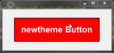
In Tkinter, you can create custom themes to give your GUI applications a unique and personalized appearance. Let’s walk through an example where we’ll create a new theme called "newtheme" and apply it to a button widget.
First, let’s import the necessary modules and set up our Tkinter window:
from tkinter import *
from tkinter import ttk

root = Tk()
root.grid_anchor('center')
Next, we’ll create our custom theme using the theme_create()"newtheme":
style = ttk.Style()
style.theme_create("newtheme")
Now, we’ll define the settings for our new theme using the theme_settings()
style.theme_settings("newtheme", {
    "TButton": {
        "configure": {
            "padding": 20,
            "font": "Arial 20 bold",
            "relief": "solid"
        },
        "map": {
            "background": [
                ("pressed", "orange"),
                ("active", "red"),
                ("pressed", "orange"),
                ("!disabled", "yellow")
            ],
            "foreground": [
                ("pressed", "green"),
                ("active", "white"),
                ("pressed", "green"),
                ("!disabled", "red")
            ]
        }
    }
})
With our custom theme settings in place, we’ll now apply the "newtheme" to our Tkinter application using the theme_use()
style.theme_use('newtheme')Finally, let’s create a button widget and place it in our Tkinter window:
btn = ttk.Button(root, text="newtheme Button")
btn.grid()
That’s it! Run the code, and you’ll see a button with the custom appearance defined by our "newtheme" theme.
root.mainloop()
By creating custom themes in Tkinter, you can easily tailor the look and feel of your GUI applications to match your design preferences and requirements.
Complete Code:
from tkinter import *
from tkinter import ttk

root=Tk()
root.grid_anchor('center')
style=ttk.Style()
style.theme_create("newtheme")
style.theme_settings("newtheme",{
    "TButton":{
    "configure":{
        "padding":20,"font":"Arial 20 bold","relief":"solid"
        },
    "map":{
        "background":[("pressed","orange"),("active","red"),("pressed","orange"),("!disabled","yellow")],
        "foreground":[("pressed","green"),("active","white"),("pressed","green"),("!disabled","red")]
    }
    }
})
style.theme_use('newtheme')

btn=ttk.Button(root,text="newtheme Button")
btn.grid()

root.mainloop()
Output :
Conclusion
Great job! You’ve become a pro at using ttk and ttk style in Tkinter. We’ve covered a lot: ttk widgets, widget elements, themes, and cool styling features. You’ve learned how to change themes, tweak styles, and even make your themes.
We hope you enjoyed learning and feel confident now. So go ahead, create some awesome-looking GUIs! Let your imagination take over with ttk and ttk style in Tkinter!