Tkinter Standard Options
Welcome to our Python Tkinter tutorial series!
In Tkinter, widgets are the building blocks of graphical user interfaces (GUIs). Each widget comes with its set of options that you can configure to tailor its appearance and behavior to your needs. These options are classified into two categories: standard options and widget-specific options.
Standard options are common across most Tkinter widgets, providing basic functionality and styling. These options allow you to control aspects like size, position, color, and text content. Understanding these standard options is crucial for effectively using Tkinter widgets in your Python applications.
Tkinter standard options can be categorized into several types based on their functionality and usage.
Let’s explore each type:
Table of Contents
- Color and Appearance Options
- Border and Padding Options
- Text and Font Options
- Positioning and Alignment Options
- Selection Options in Tkinter Widgets
- Insert Options To Enhance Text Cursor Visibility
- Enhancing Focus with Highlight Options in Tkinter Widgets
- Enhancing Behavior and Interaction in Tkinter Widgets
- Enriching Your Tkinter Widgets with Image Options
- Navigating Your Tkinter Widgets with Scrollbars
Color and Appearance Options
In Tkinter, you have several options to play around with the colors and appearance of your widgets. Let’s dive into each of them and understand how they can enhance the visual appeal of your application.
activebackground and activeforeground
Imagine you have a button in your Tkinter interface. If you want that button to change its background color and text color when someone clicks on it, then these options are really important.
Acceptable values: Any valid color specification, like color names (e.g., “red”, “blue”), hexadecimal values (e.g., “#FF0000”), or RGB tuples (e.g., (255, 0, 0)).
Example:
import tkinter as tk

root = tk.Tk()
root.geometry("200x100")

# Button with active background and foreground
button = tk.Button(root, text="Click Me", activebackground="blue", activeforeground="white")
button.pack(pady=10)

root.mainloop()
Output:
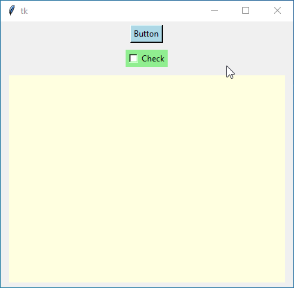
background and foreground
The background option determines the background color of your widget, such as a button or a label. Meanwhile, the foreground option sets the color of the text inside that widget. For instance, if you want a button with a blue background and white text, you would set background='blue' and foreground='white'.
Acceptable values: Any valid color specification.
Example – 1:
import tkinter as tk

root = tk.Tk()

# Button with background color
button = tk.Button(root, text="Button", bg="lightblue")
button.pack(padx=10, pady=5)

# Checkbutton with background color
checkbutton = tk.Checkbutton(root, text="Check", bg="lightgreen")
checkbutton.pack(padx=10, pady=5)

# Canvas with background color
canvas = tk.Canvas(root, bg="lightyellow", width=400, height=300)
canvas.pack(padx=10, pady=5)

root.mainloop()
Output:
Example – 2:
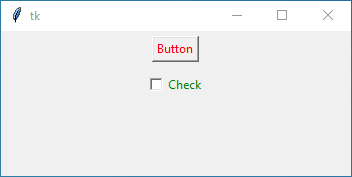
import tkinter as tk

root = tk.Tk()

# Button with foreground color
button = tk.Button(root, text="Button", fg="red")
button.pack(padx=10, pady=5)

# Checkbutton with foreground color
checkbutton = tk.Checkbutton(root, text="Check", fg="green")
checkbutton.pack(padx=10, pady=5)

root.mainloop()
Output:
disabledforeground
Sometimes you might want to show that a widget, like a button, is disabled and can’t be clicked. This option lets you set the text color for the widget when it’s in that disabled state.
Acceptable values: Any valid color specification.
Example:
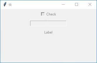
import tkinter as tk

root = tk.Tk()

# Checkbutton with disabled foreground color
checkbutton = tk.Checkbutton(root, text="Check", state="disabled", disabledforeground="gray")
checkbutton.pack(padx=10, pady=5)

# Entry with disabled foreground color
entry = tk.Entry(root, state="disabled", disabledforeground="gray")
entry.pack(padx=10, pady=5)

# Label with disabled foreground color
label = tk.Label(root, text="Label", state="disabled", disabledforeground="gray")
label.pack(padx=10, pady=5)

root.mainloop()
Output:
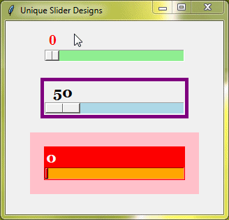
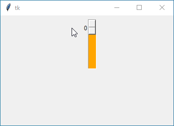
troughcolor
This one is a bit specific. It’s mainly used for widgets like scales (those little sliders) or scrollbars. The trough is the background area where the slider moves. So, with troughcolor, you can change the color of that background part.
Acceptable values: Any valid color specification.
Example:
import tkinter as tk

root = tk.Tk()

# Scale with custom trough color
scale = tk.Scale(root, from_=0, to=100, troughcolor="orange")
scale.pack(padx=10, pady=5)

root.mainloop()
Output:
Border and Padding Options
Now, let’s talk about the border and padding options. These options help you control the appearance of your widget’s border and add some space around its contents for a cleaner look. Let’s break it down in simple terms.
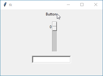
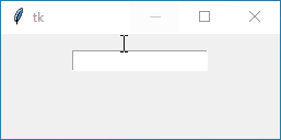
borderwidth or bd
The borderwidth option determines how thick the border around your widget, like a button or a frame, should be. If you want a thicker border, you increase the value of borderwidth. On the other hand, if you prefer a thinner border, you decrease the value.
You can set it to any number, like 1, 2, 3, and so on. This number shows how wide the border is in pixels.
Example:
import tkinter as tk

root = tk.Tk()

# Button with 0 border width
button = tk.Button(root, text="Button", borderwidth=0)
button.pack(pady=5)

# Scale with a thin border
scale = tk.Scale(root, from_=0, to=100, bd=1)
scale.pack(pady=5)

# Entry with a thick border
entry = tk.Entry(root, borderwidth=4)
entry.pack(pady=5)

root.mainloop()
Output:
padx and pady
Padding is the space between the content and the border. This makes your widget look neater and more organized. With padx and pady, you can control the amount of padding horizontally (left and right) and vertically (top and bottom).
You can set these options to any number, like 5, 10, or whatever suits your design. This number represents the amount of padding in pixels.
Example:
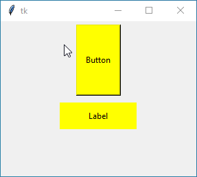
import tkinter as tk

root = tk.Tk()

# Button with horizontal and vertical padding
button = tk.Button(root, text="Button", padx=10, pady=40, bg="yellow")
button.pack(pady=5)

# Label with different horizontal and vertical padding
label = tk.Label(root, text="Label", padx=40, pady=10, bg="yellow")
label.pack(pady=5)

root.mainloop()
Output:
relief
The relief option determines the style of the border around your widget.
You have a few choices here:
flat | No visible border |
raised | Border appears raised from the surface |
sunken | Border appears sunken into the surface |
groove | Border appears as a groove carved into the surface |
ridge | Border appears as a ridge sticking out from surface |
Example:
import tkinter as tk

root = tk.Tk()

# Button with a flat border
button = tk.Button(root, text="Button", relief="flat")
button.pack(pady=5)

# Radiobutton with a sunken border
radiobutton = tk.Radiobutton(root, text="Radiobutton", relief="sunken")
radiobutton.pack(pady=5)

# Scale with a raised border
scale = tk.Scale(root, from_=0, to=100, relief="raised")
scale.pack(pady=5)

root.mainloop()
Output:
Text and Font Options
The text and font options allow us to control what text is displayed in our widgets and how it looks.
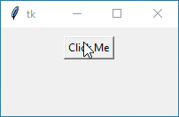
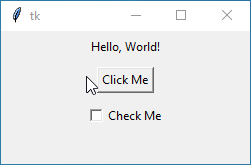
text
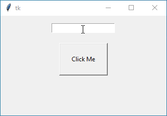
This option lets you directly set the text displayed in a widget, like a label or a button. You can just type whatever you want the widget to display.
Example:
import tkinter as tk

root = tk.Tk()

# Label with static text
label = tk.Label(root, text="Hello, World!")
label.pack(pady=5)

# Button with custom text
button = tk.Button(root, text="Click Me")
button.pack(pady=5)

# Checkbutton with text
checkbutton = tk.Checkbutton(root, text="Check Me")
checkbutton.pack(pady=5)

root.mainloop()
Output:
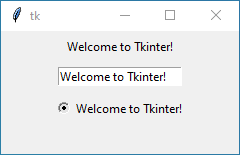
textvariable
Instead of directly setting the text, you can link the textvariable option to a Tkinter variable. When the variable’s value changes, the text in the widget updates automatically.
You’ll just need to create a Tkinter variable (like StringVar()) and link it to your widget using this option.
Example:
import tkinter as tk

root = tk.Tk()

# Text variable
text_var = tk.StringVar()
text_var.set("Welcome to Tkinter!")

# Label with text variable
label = tk.Label(root, textvariable=text_var)
label.pack(pady=5)

# Entry with text variable
entry = tk.Entry(root, textvariable=text_var)
entry.pack(pady=5)

# Radiobutton with text variable
radio = tk.Radiobutton(root, textvariable=text_var, value="Option 1")
radio.pack(pady=5)

root.mainloop()
Output:
font
Next up, the font option lets us pick how our text looks. We can choose the font style, size, and family to make it stand out or blend in with our design.
You just need to specify the font details in a tuple, like ('Arial', 12, 'bold').
Example:
import tkinter as tk
root = tk.Tk()
# Font for the widgets
custom_font = ('verdana', 18, 'bold')
# Label with custom font
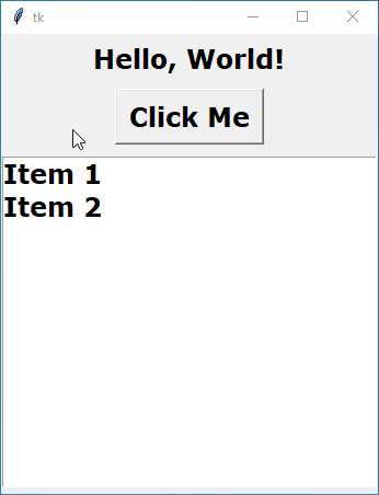
label = tk.Label(root, text="Hello, World!", font=custom_font)
label.pack(pady=5)
# Button with custom font
button = tk.Button(root, text="Click Me", font=custom_font)
button.pack(pady=5)
# Listbox with custom font
listbox = tk.Listbox(root, font=custom_font)
listbox.insert(1, "Item 1")
listbox.insert(2, "Item 2")
listbox.pack(pady=5)
root.mainloop()Output:
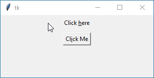
underline
You can use the underline option to underline a specific character in your text, like creating a hyperlink or indicating a keyboard shortcut.
Just specify the index of the character you want to underline (starting from 0).
Example:
import tkinter as tk

root = tk.Tk()

# Label with underlined text
label = tk.Label(root, text="Click here", underline=6)
label.pack(pady=5)

# Button with underlined text
button = tk.Button(root, text="Click Me", underline=2)
button.pack(pady=5)

root.mainloop()
Output:
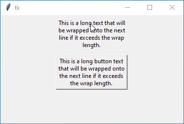
wraplength
Lastly, If you want your text to wrap to the next line when it reaches a certain width, you can use the wraplength option to set the maximum width before wrapping occurs.
You just need to specify the value in pixels.
Example:
import tkinter as tk

root = tk.Tk()

# Label with wrapped text
label = tk.Label(root, text="This is a long text that will be wrapped onto the next line if it exceeds the wrap length.", wraplength=150)
label.pack(pady=5)

# Button with wrapped text
button = tk.Button(root, text="This is a long button text that will be wrapped onto the next line if it exceeds the wrap length.", wraplength=150)
button.pack(pady=5)

root.mainloop()
Output:
Positioning and Alignment Options
Positioning and Alignment Options in Tkinter help you control the placement and alignment of widgets. Here’s what each option does:
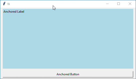
anchor
First up, we’ve got the anchor option. This option lets you specify where the widget should be anchored within its allocated space.
You have a range of simple directions to choose from: “north” ("n"), “south” ("s"), “east” ("e"), and “west” ("w"). Combine them to create custom placements. You can also use combinations like “northwest” ("nw"), “northeast” ("ne"), “southwest” ("sw"), or “southeast” ("se"). Lastly, remember the option for "center" to position your widget precisely at the center.
Example:
import tkinter as tk

root = tk.Tk()

# Label with anchored positioning
label = tk.Label(root, text="Anchored Label", bg="lightblue", anchor="nw")
label.pack(fill=tk.BOTH, expand=True, padx=10, pady=5)

# Button with anchored positioning
button = tk.Button(root, text="Anchored Button", anchor="center")
button.pack(fill=tk.X, padx=10, pady=5)

root.mainloop()
Output:
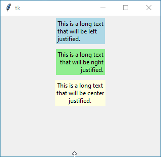
justify
Next, we have the justify option. If your widget contains multiple lines of text, this option allows you to specify how the text should be aligned within each line. You can choose between "left", "center", or "right" alignment.
Example:
import tkinter as tk

root = tk.Tk()

# Label with justified text
label1 = tk.Label(root, text="This is a long text that will be left justified.", justify="left", bg="lightblue", wraplength=100)
label1.pack(pady=5)

label2 = tk.Label(root, text="This is a long text that will be right justified.", justify="right", bg="lightgreen", wraplength=100)
label2.pack(pady=5)

label3 = tk.Label(root, text="This is a long text that will be center justified.", justify="center", bg="lightyellow", wraplength=100)
label3.pack(pady=5)

root.mainloop()
Output:
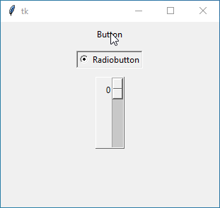
orient
The orient option is typically used with widgets like the sliders and scrollbars to determine whether the scrollbar should be oriented horizontally or vertically.
You just need to say "vertical" or "horizontal" to let your widget know which way to go.
Example:
import tkinter as tk

root = tk.Tk()

# Vertical Scrollbar
vertical_scrollbar = tk.Scrollbar(root, orient="vertical")
vertical_scrollbar.pack(side="left", fill="y")

# Horizontal Scrollbar
horizontal_scrollbar = tk.Scrollbar(root, orient="horizontal")
horizontal_scrollbar.pack(side="top", fill="x")

root.mainloop()
Output:
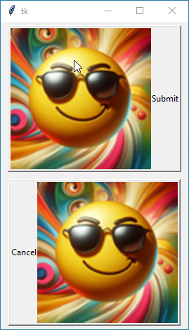
compound
When your widget, such as a button, contains both text and an image, the compound option specifies how they should be combined. You can choose where you want your image to sit in relation to the text – at the "top", "bottom", "left", or "right" of the button. You can also choose None, if you don’t want to show image.
Example:
import tkinter as tk

root = tk.Tk()

# Creating a PhotoImage
photo = tk.PhotoImage(file="cool.png")

# Button with compound text and image (left)
button1 = tk.Button(root, text="Submit", image=photo, compound="left")
button1.pack(padx=10, pady=5)

# Button with compound text and image (right)
button2 = tk.Button(root, text="Cancel", image=photo, compound="right")
button2.pack(padx=10, pady=5)

root.mainloop()
Output:
Selection Options in Tkinter Widgets
Selection Options in Tkinter Widgets allow you to customize the appearance of selected text or items within widgets.
selectbackground
First up, we have the selectbackground option. This option lets you choose the background color of selected text or items within a widget. When you select text or items, they will be highlighted with this background color.
Example:
import tkinter as tk

root = tk.Tk()

# Entry with select background
entry = tk.Entry(root, selectbackground="green", font=("arial", 20, "bold"))
entry.pack(pady=5)

# Text widget with select background
text = tk.Text(root, height=4, width=30, selectbackground="red", font=("arial", 20, "bold"))
text.pack(pady=5)

root.mainloop()
Output:
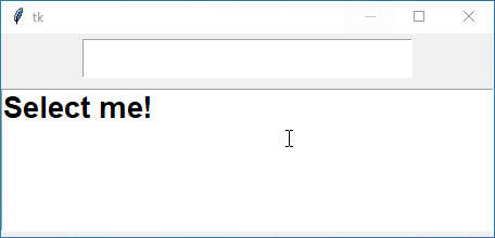
selectforeground
The selectforeground specifies the foreground color of selected text or items within a widget.
Example:
import tkinter as tk

root = tk.Tk()

# Entry with selectforeground
entry = tk.Entry(root, selectforeground="pink", font=("arial", 20, "bold"))
entry.pack(pady=5)

# Text with selectforeground
text = tk.Text(root, height=4, width=30, selectforeground="yellow", font=("arial", 20, "bold"))
text.insert(tk.END, "Select me!")
text.pack(pady=5)

root.mainloop()
Output:
Insert Options To Enhance Text Cursor Visibility
Insert Options in Tkinter control the appearance and behavior of the insertion cursor in widgets like Text and Entry.
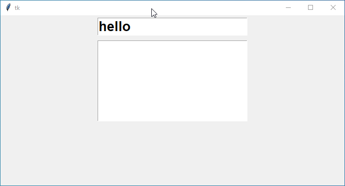
insertbackground
First off, we have the insertbackground option. This option sets the color of the insertion cursor, which is the blinking vertical line indicating where text will be inserted when typing.
Example:
import tkinter as tk

root = tk.Tk()

# Entry widget with custom cursor color
entry = tk.Entry(root, insertbackground="red", font=("arial", 20, "bold"))
entry.pack(pady=5)

# Text widget with custom cursor color
text = tk.Text(root, insertbackground="pink", font=("arial", 20, "bold"), width=20, height=5)
text.pack(pady=5)

root.mainloop()
Output:
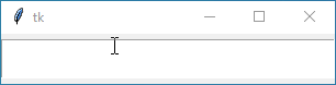
insertborderwidth
The insertborderwidth option determines the thickness of the border around the insertion cursor.
Example:
import tkinter as tk

root = tk.Tk()

# Entry widget with custom cursor width
text = tk.Entry(root, insertwidth=20, font=("arial", 20, "bold"))
text.pack(pady=5)

root.mainloop()
Output:
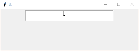
insertwidth
Moving on, we’ve got the insertwidth option. This option specifies the width of the insertion cursor, usually measured in pixels.
Example:
import tkinter as tk

root = tk.Tk()

# Entry widget with border around cursor
entry = tk.Entry(root, insertbackground="yellow", insertborderwidth=5, insertwidth=20, font=("arial", 20, "bold"))
entry.pack(pady=5)

root.mainloop()
Output:
insertontime and insertofftime
Lastly, we have the insertontime and insertofftime options.
The insertontime helps you to define the time in milliseconds that the insertion cursor remains visible before blinking off.
And the insertofftime specifies the time in milliseconds that the insertion cursor remains invisible before blinking back on.
Example:
import tkinter as tk

root = tk.Tk()

# Text widget with customized cursor blinking speed
text = tk.Text(root, insertontime=100, insertofftime=1000, width=40, height=10)
text.pack(pady=5)

root.mainloop()
Output:
Enhancing Focus with Highlight Options in Tkinter Widgets
Highlight Options in Tkinter Widgets are used to create a highlight effect for widgets when they receive focus or input.
highlightthickness
First off, we have the highlightthickness option. This option determines the thickness of the highlight border around the widget. Increasing this value creates a thicker border, while decreasing it reduces the thickness.
Example:
import tkinter as tk

root = tk.Tk()

# Entry widget with custom highlight thickness
entry = tk.Entry(root, highlightthickness=10)
entry.pack(pady=5)

# Button widget with custom highlight thickness
button = tk.Button(root, text="Click Me", highlightthickness=20)
button.pack(pady=5)

root.mainloop()
Output:
highlightcolor
Next up, we’ve got the highlightcolor option. When a widget gains focus, this option sets the color of the highlight border. You can choose any valid color specification, such as color names, hexadecimal values, or RGB tuples.
Example:
import tkinter as tk

root = tk.Tk()

# Entry widget with custom highlight color
entry = tk.Entry(root, highlightcolor="green", highlightthickness=10)
entry.pack(pady=5)

root.mainloop()
Output:
highlightbackground
Last but not least, we have the highlightbackground option. This one sets the background color of the highlight border when your widget is not in focus.
Example:
import tkinter as tk

root = tk.Tk()

# Entry widget with custom highlight background
entry = tk.Entry(root, highlightbackground="red", highlightthickness=10)
entry.pack(pady=5)

root.mainloop()
Output:
Enhancing Behavior and Interaction in Tkinter Widgets
Behavior and Interaction options allow you to customize how your widgets behave and interact with users, making your GUI more dynamic and user-friendly.
cursor
With this option, you can determine the appearance of the cursor when it hovers over the widget. You can set it to different cursor types like an arrow, hand, or hourglass to indicate different states or actions.
Example:
import tkinter as tk

root = tk.Tk()

# Button widget with custom cursor
button = tk.Button(root, text="Click Me", cursor="hand2")
button.pack(pady=5)

# Entry widget with custom cursor
entry = tk.Entry(root, cursor="cross")
entry.pack(pady=5)

root.mainloop()
Output:
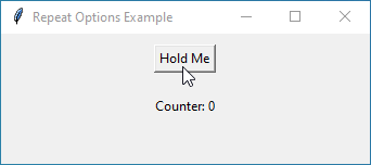
repeatdelay and repeatinterval
These options are typically used with buttons or other widgets that support continuous actions when held down. repeatdelay sets the initial delay before the action starts repeating, and repeatinterval sets the interval between each repeated action.
Example:
import tkinter as tk

def increase_counter():
    global counter
    counter += 1
    label.config(text=f"Counter: {counter}")

root = tk.Tk()
root.title("Repeat Options Example")

# Global counter variable
counter = 0

# Button widget with customized repeat delay and interval
button = tk.Button(root, text="Hold Me", command=increase_counter, repeatdelay=1000, repeatinterval=200)
button.pack(pady=10)

# Label to display the counter
label = tk.Label(root, text="Counter: 0")
label.pack(pady=10)

root.mainloop()
In this code:
- The
repeatdelayoption is set to 1000 milliseconds (1 second), which means there will be a 1-second delay before the first repeat action when the button is held down. - The
repeatintervaloption is set to 200 milliseconds, which means subsequent repeat actions will occur every 200 milliseconds after the initial delay. - Each time the button is clicked or held down, the
increase_counter()function is called to increment the counter variable.
Output:
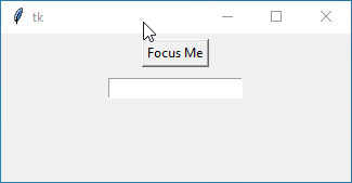
takefocus
This option determines whether a widget can receive the input focus when the user navigates through the interface using the keyboard. If set to True, the widget can receive focus; if set to False, it cannot.
Example:
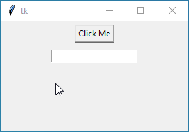
import tkinter as tk

root = tk.Tk()

# Button widget that can receive focus
button = tk.Button(root, text="Focus Me", takefocus=True)
button.pack(pady=5)

# Entry widget that cannot receive focus
entry = tk.Entry(root, takefocus=False)
entry.pack(pady=5)

root.mainloop()
Output:
Enriching Your Tkinter Widgets with Image Options
Let’s explore how to incorporate images into your Tkinter widgets to make your application more visually appealing.
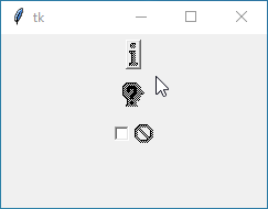
bitmap
Bitmaps are simple black and white images that are often used for icons or simple graphics. This option lets you use a built-in bitmap image provided by Tkinter.
Here are some built-in bitmaps commonly used in Tkinter:
- error
- gray75
- gray50
- gray25
- gray12
- info
- questhead
- question
- warning
- hourglass
You can use these bitmaps by simply mentioning their names in the bitmap option when creating Tkinter widgets like buttons, labels, or checkbuttons.
Example:
import tkinter as tk

root = tk.Tk()

# Button with a built-in bitmap icon
button = tk.Button(root, text="Click Me", bitmap="info")
button.pack(pady=5)

# Label with a custom bitmap icon
label = tk.Label(root, text="Hello World", bitmap="questhead")
label.pack(pady=5)

# Checkbutton with a built-in bitmap icon
checkbutton = tk.Checkbutton(root, text="Check Me", bitmap="error")
checkbutton.pack(pady=5)

root.mainloop()
Output:
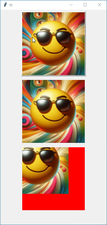
image
With the image option, you can use your image files, such as PNG or JPEG files, to display more complex images within your widgets. You can create buttons, labels, and other widgets with custom images.
Example:
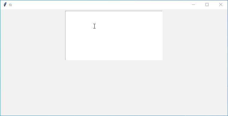
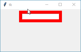
import tkinter as tk
from tkinter import PhotoImage

root = tk.Tk()

# Load a photo image
photo = PhotoImage(file="cool.png")

# Button with a photo image
button = tk.Button(root, text="Click Me", image=photo)
button.pack(pady=5)

# Label with a photo image
label = tk.Label(root, image=photo)
label.pack(pady=5)

# Canvas with a photo image
canvas = tk.Canvas(root, width=200, height=200, background='red')
canvas.create_image(50, 50, anchor=tk.CENTER, image=photo)
canvas.pack(pady=5)

root.mainloop()
Output:
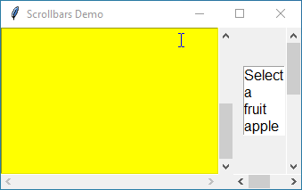
Navigating Your Tkinter Widgets with Scrollbars
Scrollbar options for tkinter widgets, specifically xscrollcommand and yscrollcommand, are used to connect scrollbars with widgets that require scrolling, like text widgets or listboxes.
xscrollcommand and yscrollcommand
This option is used to link a horizontal scrollbar with a widget, allowing horizontal scrolling. You typically set this option to the set method of the widget’s xview method. This means that when the scrollbar is moved, it updates the view of the connected widget horizontally.
Similar to xscrollcommand, the yscrollcommand option connects a vertical scrollbar with a widget, enabling vertical scrolling. You usually set this option to the set method of the widget’s yview method. Consequently, moving the scrollbar updates the view of the connected widget vertically.
Example:
from tkinter import *

root = Tk()
root.title("Scrollbars Demo")
root.grid_anchor('center')

# Function to update the listbox selection
def on_select(event):
    selected_index = listbox.curselection()
    if selected_index:
        selected_item.set(listbox.get(selected_index))

# Create a text widget
text = Text(root, background='yellow', width=30, height=10, wrap="none")

# Create vertical scrollbar for the text widget
scrollbar_text_y = Scrollbar(root, command=text.yview, orient='vertical')
scrollbar_text_y.grid(row=0, column=1, sticky="ns")

# Create horizontal scrollbar for the text widget
scrollbar_text_x = Scrollbar(root, command=text.xview, orient='horizontal')
scrollbar_text_x.grid(row=1, column=0, sticky="ew")

# Configure the text widget to use the scrollbars
text.configure(yscrollcommand=scrollbar_text_y.set, xscrollcommand=scrollbar_text_x.set)
text.grid(row=0, column=0)

# Create a listbox widget
fruits = ["apple", "banana", "orange", "melon", "watermelon", "pineapple"]
selected_item = StringVar(value="Select a fruit")

listbox = Listbox(root, height=4, width=5, font="Arial 12", listvariable=selected_item)
listbox.bind('<<ListboxSelect>>', on_select)

# Create vertical scrollbar for the listbox widget
scrollbar_list_y = Scrollbar(root, command=listbox.yview, orient='vertical')
scrollbar_list_y.grid(row=0, column=3, sticky="ns")

# Create horizontal scrollbar for the listbox widget
scrollbar_list_x = Scrollbar(root, command=listbox.xview, orient='horizontal')
scrollbar_list_x.grid(row=1, column=2, sticky="ew", columnspan=2)

# Configure the listbox widget to use the scrollbars
listbox.configure(yscrollcommand=scrollbar_list_y.set, xscrollcommand=scrollbar_list_x.set)
listbox.grid(row=0, column=2, padx=(10, 0))

# Insert items into the listbox
for fruit in fruits:
    listbox.insert(END, fruit)

root.mainloop()
Output: