
Scatter Plots
Scatter plots are visual representations of data points plotted on a graph, with one variable plotted on the x-axis and another on the y-axis. Each data point is represented by a dot, which allows us to see the relationship between the two variables. Scatter plots are commonly used to identify patterns, trends, and correlations in data.
Think of scatter plots as your pair of magical glasses. They let you see how changes in one variable might affect another. They’re great for visualizing the distribution and clustering of data points, making them a valuable tool for data analysis and exploration.
Creating Your First Scatter Plot
Imagine plotting data on hours spent studying versus exam scores. Each point on the graph would represent a student. The scatter plot would show whether there’s a relationship between study time and scores. Here’s the simple scatter plot.
Example:
# Generating a simple scatter plot
import matplotlib.pyplot as plt

# Sample data for study hours and exam scores
study_hours = [1, 2, 3, 4, 5]
exam_scores = [40, 55, 70, 80, 95]

plt.scatter(study_hours, exam_scores)
plt.xlabel('Study Hours')
plt.ylabel('Exam Scores')
plt.title('Study Hours vs Exam Scores')
plt.show()
Output:

You’ve just created your first scatter plot! Each point on the graph represents a student’s study hours and their corresponding exam scores.
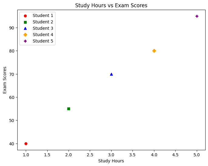
Add Different Markers and Colors to Represent Data Points
By experimenting with various marker styles and colors, you can effectively highlight different data points and convey additional information.
# Sample data for study hours and exam scores
study_hours = [1, 2, 3, 4, 5]
exam_scores = [40, 55, 70, 80, 95]
# Different markers and colors for data points
markers = ['o', 's', '^', 'D', 'P']
colors = ['red', 'green', 'blue', 'orange', 'purple']

plt.figure(figsize=(8, 6))  # Setting the size of the plot

# Looping through each data point to plot with a different marker and color
for i in range(len(study_hours)):
    plt.scatter(study_hours[i], exam_scores[i], marker=markers[i], color=colors[i], label=f'Student {i+1}')

plt.xlabel('Study Hours')
plt.ylabel('Exam Scores')
plt.title('Study Hours vs Exam Scores')

# Adding a legend to identify each data point
plt.legend()
plt.show()
Output:
Visualizing Relationships
In data analysis, visualizing relationships between variables is crucial for understanding patterns and making informed decisions. Here are three types of relationships commonly depicted in scatter plots:
Positive Correlation
In a positive correlation, as one variable increases, the other variable also tends to increase. This relationship is depicted on a scatter plot by data points sloping upwards from left to right.
Imagine you’re running an ice cream truck business. You’ve noticed that on hotter days, you sell more ice cream. Let’s plot this relationship between ice cream sales and temperature:
Example:
# Generating a positive correlation scatter plot: Ice Cream Sales vs Temperature
temperature = [25, 30, 35, 40, 45]  # Temperature in degrees Celsius
ice_cream_sales = [200, 250, 300, 350, 400]  # Number of ice creams sold

plt.scatter(temperature, ice_cream_sales, marker='o', color='orange')
plt.xlabel('Temperature (°C)')
plt.ylabel('Ice Cream Sales')
plt.title('Positive Correlation: Ice Cream Sales vs Temperature')
plt.show()
Output:
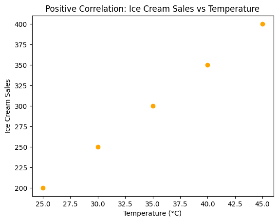
Here, as the temperature rises, so do the ice cream sales!
Negative Correlation
In a negative correlation, as one variable increases, the other variable tends to decrease. This relationship is shown on a scatter plot by data points sloping downwards from left to right.
Let’s explore the negative correlation between study hours and time spent on social media. As study hours increase, social media time tends to decrease:
Example:
# Generating a negative correlation scatter plot: Study Hours vs Social Media Time
study_hours = [1, 2, 3, 4, 5]  # Hours spent studying
social_media_time = [60, 50, 40, 30, 20]  # Time spent on social media in minutes

plt.scatter(study_hours, social_media_time, marker='x', color='blue')
plt.xlabel('Study Hours')
plt.ylabel('Social Media Time (min)')
plt.title('Negative Correlation: Study Hours vs Social Media Time')
plt.show()
Output:
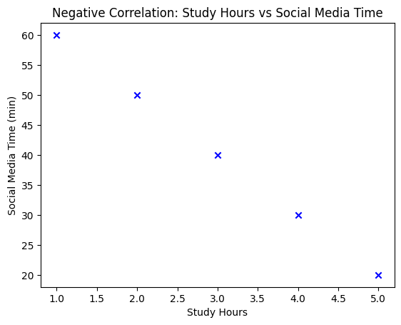
Here, as the study hours increase, the time spent on social media decreases—a classic example of a negative correlation.
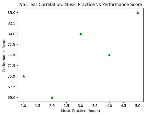
No Correlation
When there’s no relationship between two variables, the data points on a scatter plot appear randomly scattered without any observable pattern. This indicates that changes in one variable do not affect the other variable.
Consider the relationship between hours of music practice and performance scores. Sometimes, more practice doesn’t necessarily guarantee a higher score:
Example:
# Generating a scatter plot with no clear correlation: Music Practice vs Performance Score
music_practice = [1, 2, 3, 4, 5]  # Hours of music practice
performance_score = [70, 65, 80, 75, 85]  # Music performance scores

plt.scatter(music_practice, performance_score, marker='^', color='green')
plt.xlabel('Music Practice (hours)')
plt.ylabel('Performance Score')
plt.title('No Clear Correlation: Music Practice vs Performance Score')
plt.show()
Output:
Scatter plots can be customized to enhance their visual appeal and convey information more effectively.
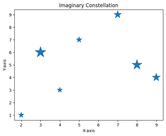
Marker Size and Shape
Adjusting the size and shape of markers can help highlight data points and emphasize patterns. Larger markers may represent higher significance or importance, while different shapes can distinguish between data categories.
Imagine plotting stars in the night sky. Let’s use different marker sizes and shapes to create a celestial masterpiece:
Example:
# Creating an imaginary constellation
import matplotlib.pyplot as plt

x = [5, 9, 3, 7, 2, 8, 4]
y = [7, 4, 6, 9, 1, 5, 3]
star_size = [200, 400, 750, 350, 180, 620, 170]

plt.scatter(x, y, s=star_size, marker='*')
plt.title('Imaginary Constellation')
plt.xlabel('X-axis')
plt.ylabel('Y-axis')
plt.show()
Output:
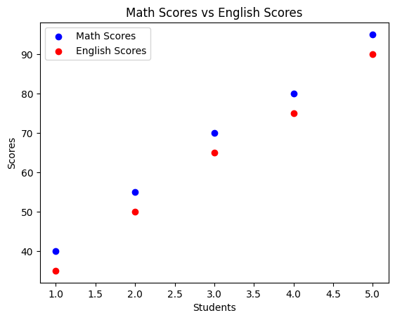
Scatter Plots with Different Colors
Using different colors for different categories in a scatter plot can help differentiate between datasets and make comparisons easier. This is particularly useful when visualizing multiple variables or groups.
Imagine we have scores from two different subjects: Math and English. We’ll represent Math scores with blue points and English scores with red points.
Example:
# Creating scatter plots with different colors for different categories
math_scores = [40, 55, 70, 80, 95]
english_scores = [35, 50, 65, 75, 90]

plt.scatter(range(1, 6), math_scores, color='blue', label='Math Scores')
plt.scatter(range(1, 6), english_scores, color='red', label='English Scores')
plt.xlabel('Students')
plt.ylabel('Scores')
plt.title('Math Scores vs English Scores')
plt.legend()
plt.show()
Output:
Using Color Maps
Color maps are a powerful tool for enhancing scatter plots and conveying additional information. They assign colors to data points based on a third variable, allowing for deeper insights into the relationships within the data.
# Using color maps for scatter plots
import numpy as np

# Generating random data for demonstration
x = np.random.rand(50)
y = np.random.rand(50)
colors = np.random.rand(50)
sizes = 1000 * np.random.rand(50)

plt.scatter(x, y, c=colors, s=sizes, cmap='viridis', alpha=0.6)
plt.colorbar()  # Adding color bar for reference
plt.xlabel('X-axis')
plt.ylabel('Y-axis')
plt.title('Scatter Plot with Color Map')
plt.show()
Output:
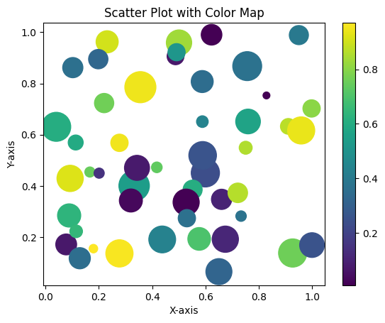
In this example, we’ve created a scatter plot with random data points, where colors are mapped based on a color map (viridis in this case). The color bar on the side helps interpret the mapping between colors and data values. And don’t worry, we will learn more about colormap in later sections.
Transparency in Scatter Plots
Transparency, also known as alpha blending, is another feature that can enhance scatter plots. By adjusting the transparency of data points, you can visualize overlapping points more clearly and emphasize areas of high density.
Transparency is particularly useful when plotting large datasets or when data points are tightly clustered together. It allows you to see individual data points while still understanding the overall distribution and patterns in the data.
The alpha parameter of scatter() controls the transparency of data points.
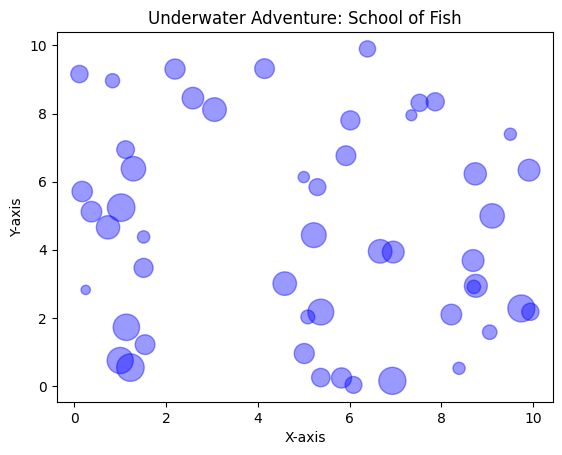
Let’s see a simple example! Using transparency, we’ll create a school of fish swimming together:
Example:
# Creating an underwater scene with a school of fish
import matplotlib.pyplot as plt
import random

# Generating coordinates for a school of fish
num_fish = 50  # Increasing the number of fish
x_fish = [random.uniform(0, 10) for _ in range(num_fish)]
y_fish = [random.uniform(0, 10) for _ in range(num_fish)]
fish_sizes = [random.uniform(30, 400) for _ in range(num_fish)]  # Varying fish sizes

plt.scatter(x_fish, y_fish, s=fish_sizes, alpha=0.4, color='blue')  # Adding transparency and varying sizes
plt.title('Underwater Adventure: School of Fish')
plt.xlabel('X-axis')
plt.ylabel('Y-axis')

plt.show()
Output:
Real-Life Example of Scatter Plot: Analyzing Happiness Index vs Outdoor Time

We’ll simulate some data for the number of hours spent outdoors and the corresponding happiness index for a group of individuals. Then, we’ll create a customized scatter plot to visualize this relationship.
Example:
import matplotlib.pyplot as plt
import numpy as np

# Generating simulated data
np.random.seed(42)
outdoor_hours = np.random.randint(1, 8, 50)  # Simulating hours spent outdoors
happiness_index = np.random.randint(30, 100, 50)  # Simulating happiness index

# Customizing the scatter plot
plt.figure(figsize=(8, 6))  # Setting the figure size
plt.scatter(
    outdoor_hours, happiness_index,
    s=happiness_index*2,  # Adjusting marker size based on happiness index
    c=outdoor_hours, cmap='viridis', alpha=0.7,  # Adjusting marker color based on outdoor hours
    marker='o', edgecolors='black'  # Using circle markers with black edges
)

# Adding labels and title
plt.xlabel('Hours Spent Outdoors')
plt.ylabel('Happiness Index')
plt.title('Happiness Index vs Outdoor Time')

# Adding a colorbar to show the relationship between marker color and outdoor hours
colorbar = plt.colorbar()
colorbar.set_label('Outdoor Hours')

# Displaying the plot
plt.grid(True)  # Adding gridlines for better visualization
plt.tight_layout()  # Adjusting layout for better appearance
plt.show()
Understanding the Code:
- Simulated Data: We generated synthetic data for hours spent outdoors and happiness index.
- Customization:
- Marker Size: Scaled by the happiness index to emphasize larger markers for higher happiness.
- Marker Color: Represented by the outdoor hours, using the
'viridis'colormap for a gradient effect. - Marker Style: Circular markers with black edges for clear visibility.
- Labels and Title: Clear labels and a descriptive title for better understanding.
- Colorbar: Added a colorbar to interpret the relationship between marker color and outdoor hours.
Output:
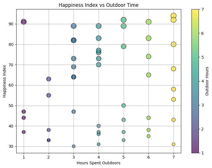
This plot visualizes the relationship between hours spent outdoors and the corresponding happiness index, where larger markers and colors represent higher happiness and longer outdoor times. Feel free to tweak the parameters to explore different visualizations!


Thanks for breaking this down into easy-to-understand terms.