Pie Charts
Pie charts are valuable tools for presenting and analyzing categorical data. They divide a circle into slices, where each slice represents a category. It enables quick comparison of different categories by visually comparing the sizes of their respective slices. This makes it easy to identify which categories are larger or smaller than each other.

When to Use Pie Charts (and When Not To)
- Use Them When… You want to showcase parts of a whole, emphasizing proportions or percentages within categories.
- Avoid Them When… The data has too many categories or is too complex for clear representation in a pie chart. Also, when comparing values or trends between categories, other chart types might be more suitable.
Creating a Basic Pie Chart
To create a basic pie chart in Matplotlib, we use the pie() function. This function takes in data values and labels and plots them as slices in the pie chart. Here’s how to do it:
Example:
import matplotlib.pyplot as plt

# Data for our pie chart (let's say, sales distribution)
categories = ['Electronics', 'Clothing', 'Books', 'Toys']
sales = [300, 450, 200, 350]  # Sales values for each category

# Plotting the pie chart
plt.figure(figsize=(8, 8))  # Adjusting the size of our pie (optional)
plt.pie(sales, labels=categories, autopct='%1.1f%%', startangle=90)
plt.title('Sales Distribution')  # Adding a title to our pie chart
plt.show()
In this code:
categoriesandsales: These are our categories and their respective sales values.plt.figure(figsize=(8, 8)): This line sets the size of our pie chart. You can adjust it to your liking!plt.pie(): We use this function to create our pie chart.- sales are the values for each slice.
labels: categories assign labels to each slice, making our pie chart informative.autopct='%1.1f%%': This neat little code snippet adds percentage labels to each slice.startangle=90: Rotates the start of the pie chart to make it look prettier.
Output:
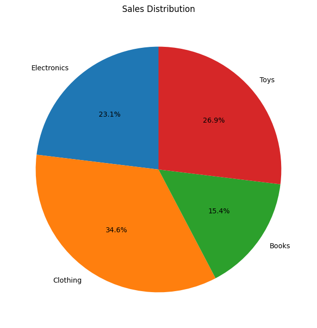
You’ve successfully crafted a simple pie chart showcasing sales distribution across different categories. Each slice represents a category, and the size of the slice represents its proportion of the total sales.
Now that you’ve got the basics down, let’s customize your pie chart to enhance its appearance.
Change Colors in the Pie Chart
You can specify custom colors for each slice using the colors parameter in the pie() function.
Example:
# Customizing our pie chart
colors = ['#ff9999', '#66b3ff', '#99ff99', '#ffcc99']  # Custom colors for each category

plt.figure(figsize=(8, 8))
plt.pie(sales, labels=categories, autopct='%1.1f%%', startangle=90, colors=colors)
plt.title('Sales Distribution with a Splash of Color')
plt.show()
Output:

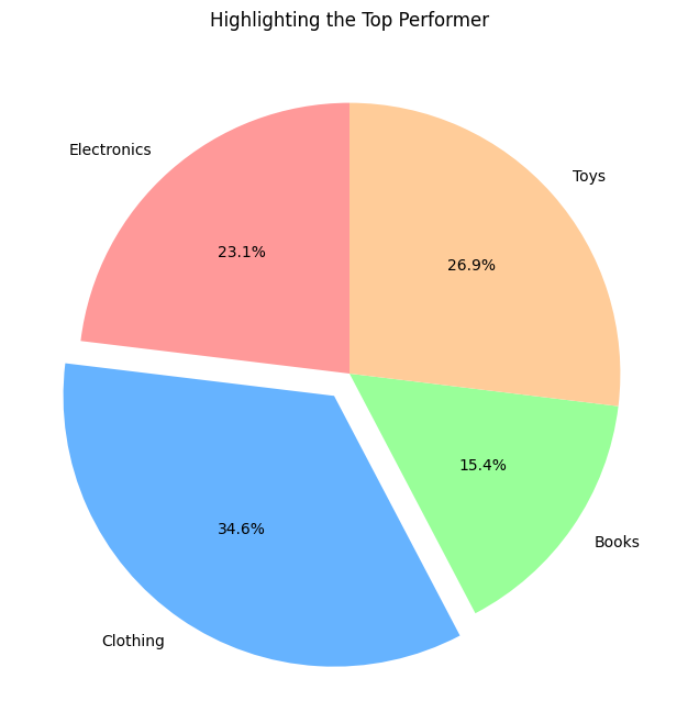
Showcasing Specific Slices
Imagine you’re presenting sales data to a group, and you want to highlight the highest-selling category or draw attention to a significant change. This is where emphasizing a particular slice becomes helpful. You can emphasize certain slices by “exploding” them out from the center of the pie chart.
The explode parameter in the pie() function allows you to specify the extent to which each slice is exploded.
Example:
# Emphasizing the highest-selling category in our sales data
max_sales = max(sales)  # Finding the maximum sales value
explode = [0 if sale < max_sales else 0.1 for sale in sales]  # Emphasizing the highest-selling category

plt.figure(figsize=(8, 8))
plt.pie(sales, labels=categories, autopct='%1.1f%%', startangle=90, colors=colors, explode=explode)
plt.title('Highlighting the Top Performer')
plt.show()
Understanding the Customization:
max_sales = max(sales): Identifying the highest sales value among categories.explode = [0 if sale < max_sales else 0.1 for sale in sales]: Emphasizing the slice corresponding to the highest sales by pulling it out slightly.
Output:
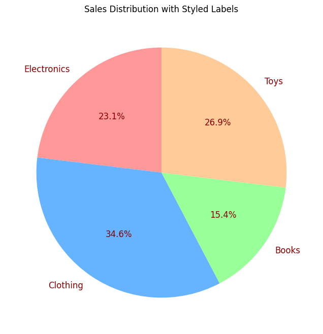
textprops for Label Customization
You can customize the appearance of the text labels inside the pie chart. Use the textprops parameter to set properties such as font size, font weight, and font color for the labels.
Example:
# Customizing labels with textprops
label_props = {'fontsize': 12, 'color': 'darkred'}

plt.figure(figsize=(8, 8))
plt.pie(sales, labels=categories, autopct='%1.1f%%', startangle=90, colors=colors, textprops=label_props)
plt.title('Sales Distribution with Styled Labels')
plt.show()
Output:
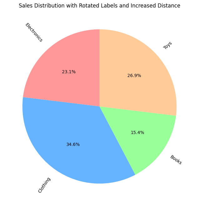
Adjusting Label Distance and Rotating Labels
You can control the distance of the text labels from the center of the pie chart using the labeldistance parameter.
And you can rotate labels to improve readability or adjust their orientation using the rotatelabels parameter. This parameter accepts a Boolean value to specify whether to rotate labels or not.
Example:
# Adjusting label distance and rotating labels
plt.figure(figsize=(8, 8))
plt.pie(sales, labels=categories, autopct='%1.1f%%', startangle=90, colors=colors, labeldistance=1.1, rotatelabels=True)
plt.title('Sales Distribution with Rotated Labels and Increased Distance')
plt.show()
Output:
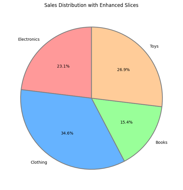
Tweaking Slices with wedgeprops
You can adjust properties of individual wedges, such as edge color and line width, using the wedgeprops parameter.
Example:
# Enhancing slices with wedgeprops
wedge_props = {'linewidth': 2, 'edgecolor': 'gray'}

plt.figure(figsize=(8, 8))
plt.pie(sales, labels=categories, autopct='%1.1f%%', startangle=90, colors=colors, wedgeprops=wedge_props)
plt.title('Sales Distribution with Enhanced Slices')
plt.show()
Output:
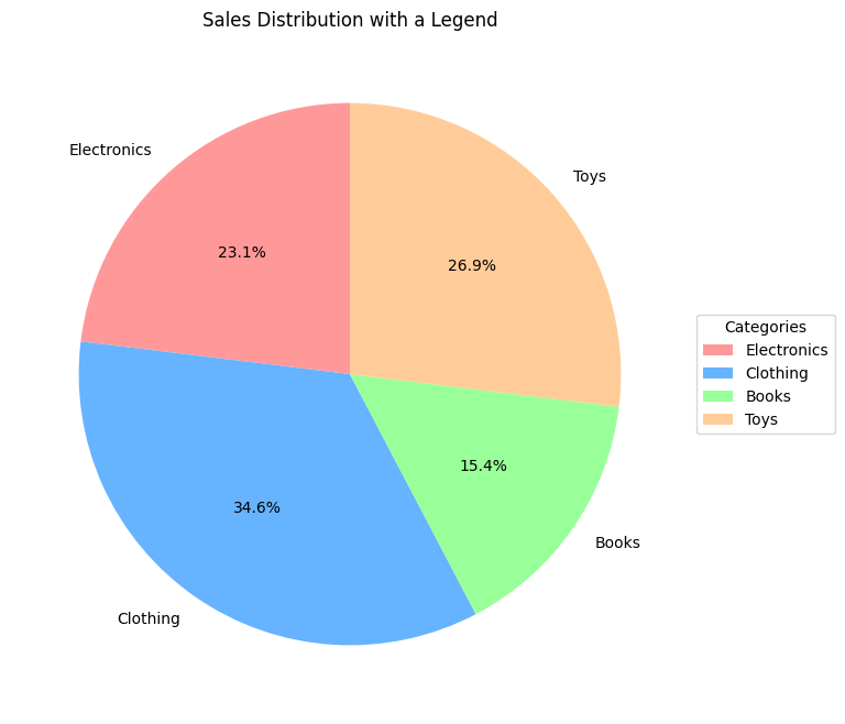
Adding a Legend in Pie Chart
Adding a legend to a pie chart in Matplotlib helps viewers understand the categories represented by each slice. The legend parameter helps you create a legend for your pie chart:
Example:
# Adding a legend outside the pie chart
plt.figure(figsize=(8, 8))
plt.pie(sales, labels=categories, autopct='%1.1f%%', startangle=90, colors=colors)
plt.title('Sales Distribution with a Legend')
plt.legend(title='Categories', loc='center left', bbox_to_anchor=(1, 0.5))
plt.show()
Output:
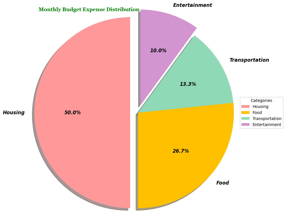
Real-World Example of Pie Chart: Monthly Budget Expense Distribution
Imagine, you’re a savvy budgeter, and you want to visualize how your monthly expenses break down into different categories.

Let’s consider the following expense categories and their respective amounts for a typical month:
- Housing: $1500
- Food: $800
- Transportation: $400
- Entertainment: $300
Example:
import matplotlib.pyplot as plt

# Data for our monthly expenses
categories = ['Housing', 'Food', 'Transportation', 'Entertainment']
expenses = [1500, 800, 400, 300]
colors = ['#ff9999', '#ffc000', '#8fd9b6', '#d395d0']  # Custom vibrant colors

# Customizing labels and slice explode
explode = (0.1, 0, 0, 0.1)

# Customizing labels with textprops for font style and weight
text_props = {'fontsize': 12, 'fontstyle': 'italic', 'fontweight': 'bold'}

# Adjusting radius and adding a shadow effect
plt.figure(figsize=(10,9))
plt.pie(expenses, labels=categories, autopct='%1.1f%%', startangle=90, colors=colors,
        explode=explode, shadow=True, radius=1.2, textprops=text_props)
plt.title('Monthly Budget Expense Distribution', loc='left', fontdict={'fontsize': 13, 'fontweight': 'bold', 'font':'georgia'}, color="green")

# Adding a legend outside the pie chart
plt.legend(title='Categories', loc='center left', bbox_to_anchor=(1, 0.5))
plt.show()
Explanation:
- Custom vibrant colors have been chosen to represent each expense category.
- The
explodeparameter highlights Housing and Entertainment categories. - Text properties have been adjusted for bold and italicized labels.
- A shadow effect adds depth and dimension to the pie chart.
- The legend outside the chart labels each expense category for clarity.
Output: