Line Plot
A line plot is a basic type of chart used in data visualization to display data points connected by straight line segments. It is commonly used to show trends over time or relationships between variables. Line plots are simple yet powerful tools for visualizing data and gaining insights into patterns and trends. We have learned to create a basic Line Plot, now let’s explore further.
Create a Line Plot with Customization
To create a line plot with customization, we can specify markers, line styles, and colors to make our plot more visually appealing and informative. Here’s a simple example.
Example:
# Drawing a line graph with customization
plt.plot([1, 2, 3, 4], [1, 4, 9, 16], marker='o', linestyle='--', color='green')
plt.show()
Output:
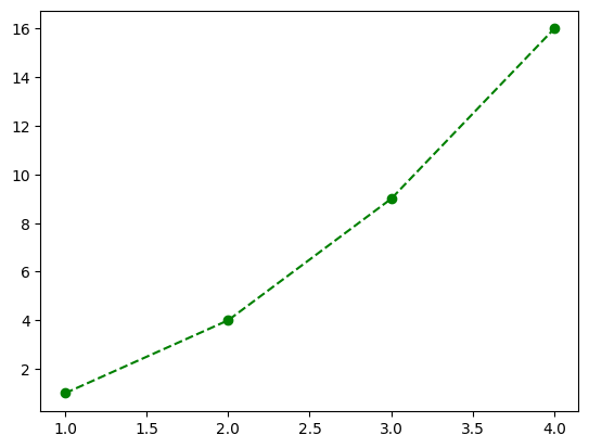
Look at that! We’ve got a green, dashed-line graph with circular markers.
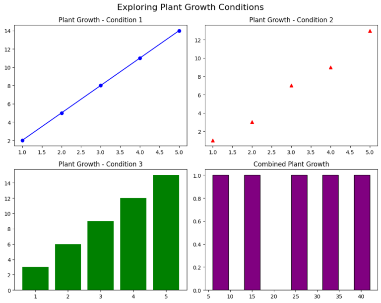
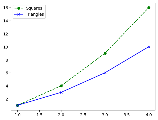
Line Plot with Multiple Lines
You can plot multiple lines on the same graph, each with its label, and display a legend to differentiate between them. Here’s an example and try experimenting with different colors, line styles, and markers to make your graphs uniquely yours!
Example:
# Adding more lines and customizing them
plt.plot([1, 2, 3, 4], [1, 4, 9, 16], marker='o', linestyle='--', color='green', label='Squares')
plt.plot([1, 2, 3, 4], [1, 3, 6, 10], marker='x', linestyle='-', color='blue', label='Triangles')
plt.legend()  # Show labels in the plot
plt.show()
Output:
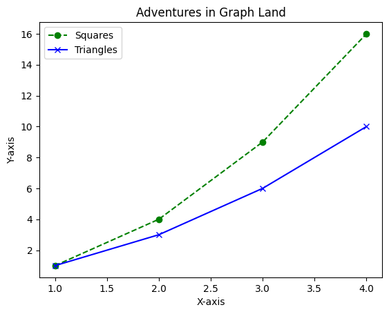
Adding Title and Labels to the Graph
To enhance the clarity of your plot, you can add a title, as well as labels for the x-axis and y-axis.
Example:
# Adding title and labels to the graph
plt.plot([1, 2, 3, 4], [1, 4, 9, 16], marker='o', linestyle='--', color='green', label='Squares')
plt.plot([1, 2, 3, 4], [1, 3, 6, 10], marker='x', linestyle='-', color='blue', label='Triangles')
plt.legend()  # Show labels in the plot
plt.title('Adventures in Graph Land')  # Title of our graph
plt.xlabel('X-axis')  # Label for the X-axis
plt.ylabel('Y-axis')  # Label for the Y-axis
plt.show()
Output:
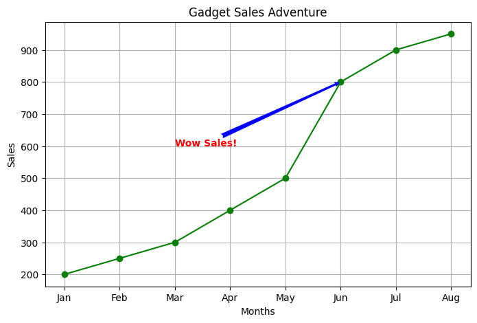
Real-Life Example: Tracking Plant Growth
Imagine you’ve planted a seed, and each week, you measure the height of the growing plant. Let’s create a line plot to visualize this growth using Matplotlib!
First, we’ll create some data representing the weeks and the corresponding height of the plant:
weeks = [1, 2, 3, 4, 5, 6, 7]  # Weeks
height = [2, 5, 9, 12, 16, 18, 20]  # Height of the plant in inches
Now, we’ll use Matplotlib to plot the growth of our plant over these weeks:
import matplotlib.pyplot as plt

# Data for weeks and plant height
weeks = [1, 2, 3, 4, 5, 6, 7]  # Weeks
height = [2, 5, 9, 12, 16, 18, 20]  # Height of the plant in inches

# Creating the line plot
plt.plot(weeks, height, marker='o', linestyle='-', color='green')

# Adding labels and title
plt.title('Plant Growth Over Time')
plt.xlabel('Weeks')
plt.ylabel('Height (inches)')

# Adding some fun annotation
plt.text(4, 14, 'Wow! Rapid growth!', fontsize=10, color='blue')

# Display the plot
plt.show()
By running this code, you’ll see a lovely graph showing the growth of your plant over time. Each point represents the height of the plant at a specific week, and you can easily spot how quickly it grew in certain weeks!