Histogram
Histograms in Matplotlib help us see how data spreads out. They group data into bins and show how many data points fall into each bin.
Imagine putting data into boxes, or bins, along a line. The height of each box in a histogram shows how many data points are in that bin. They show if data is bunched up in the middle, spread out evenly, or if there are some extreme values. This is important for spotting trends or unusual patterns in data.
For example, if we’re looking at test scores, a histogram can tell us if most students scored average, or if scores were all over the place.
By looking at the shape of a histogram, we can tell if data is balanced or skewed to one side. This helps us make smarter decisions based on data, whether it’s about finances, health, or social trends.

Creating Basic Histograms
To create a basic histogram in Matplotlib, we use the hist() function. This function automatically divides the data into bins and plots the frequency of data points within each bin.
Now, let’s grab some sample data—Imagine you have exam scores and want to see how many students scored within different score ranges (say 0-20, 20-40, 40-60, and so on). The histogram would visualize this, showing if scores are mostly clustered in one range or spread out across various ranges.
Example:
# Generating a simple histogram
import matplotlib.pyplot as plt

# Sample exam scores data
exam_scores = [65, 75, 85, 55, 60, 70, 80, 85, 90, 92, 75, 80, 85]

plt.hist(exam_scores)
plt.xlabel('Exam Scores')
plt.ylabel('Frequency')
plt.title('Histogram of Exam Scores')
plt.show()
Output:
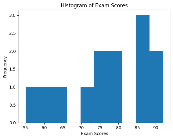
You’ve just created your first histogram! Each bar represents the frequency of scores falling within a particular range.
Specify the Number of Bins for Optimal Representation
By default, Matplotlib chooses the number of bins automatically. However, we can customize these settings to better suit our data. Here’s how to specify the number of bins:
Example:
# Customizing the number of bins in the histogram
plt.hist(exam_scores, bins=5)  # Changing the number of bins to 5
plt.xlabel('Exam Scores')
plt.ylabel('Frequency')
plt.title('Histogram of Exam Scores with 5 Bins')
plt.show()
Output:

See how the histogram changes with fewer bins.
Colors and Edge Colors
In Matplotlib, we can make histograms stand out by customizing their colors and edge colors. You can specify the fill color with the color option and the color of the edges of the bars with the edgecolor option.
Example:
# Generating a simple histogram
import matplotlib.pyplot as plt

# Sample exam scores data
exam_scores = [65, 75, 85, 55, 60, 70, 80, 85, 90, 92, 75, 80, 85]

# Customizing colors and edge colors in histograms
plt.hist(exam_scores, bins=5, color='red', edgecolor='black')
plt.xlabel('Exam Scores')
plt.ylabel('Frequency')
plt.title('Histogram of Exam Scores with Custom Colors')
plt.show()
Output:
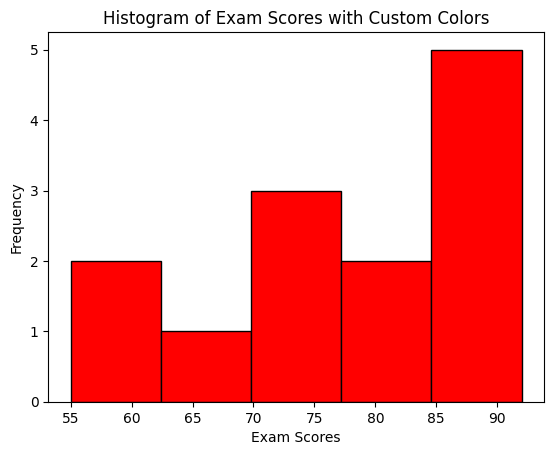
Multiple Colors for Multiple Datasets
If you’re comparing different sets of data in the histogram, using different colors for each set makes it clear which is which, making it easier to compare and analyze.
Let’s create an example showcasing multiple colors for the histogram bars.
Example:
# Customizing colors for different bins in histograms
import numpy as np

# Create a figure with a specific size (width, height)
plt.figure(figsize=(9, 6))

# Sample data for demonstration
np.random.seed(42)
data1 = np.random.normal(0, 1, 1000)
data2 = np.random.normal(2, 1, 1000)

plt.hist([data1, data2], bins=20, color=['skyblue', 'salmon'], edgecolor='black')
plt.xlabel('Value')
plt.ylabel('Frequency')
plt.title('Histogram with Multiple Colors')
plt.legend(['Data 1', 'Data 2'])
plt.show()
Output:
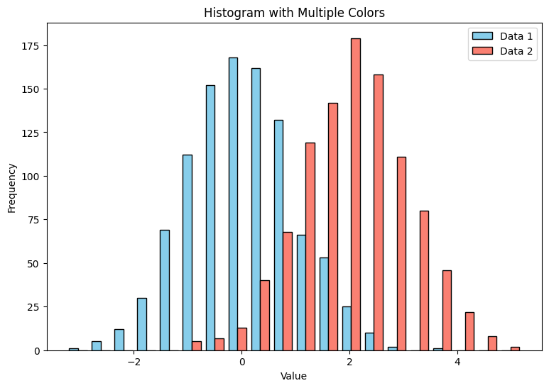
This example uses two datasets (data1 and data2) and assigns different colors to them ('skyblue' and 'salmon'). The legend() function allows you to add a legend, ensuring clarity when displaying multiple datasets.
Transparency in Histogram
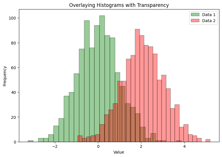
In the histogram, adjusting the transparency with the alpha parameter allows us to see overlapping bars more clearly, aiding in understanding the distribution of data.
Example:
# Customizing histograms with transparency for overlaid visualization
import numpy as np

# Create a figure with a specific size (width, height)
plt.figure(figsize=(9, 6))

# Generating sample data
np.random.seed(42)
data1 = np.random.normal(0, 1, 1000)
data2 = np.random.normal(2, 1, 1000)

plt.hist(data1, bins=30, color='green', alpha=0.4, edgecolor='black', label='Data 1')
plt.hist(data2, bins=30, color='red', alpha=0.4, edgecolor='black', label='Data 2')

plt.xlabel('Value')
plt.ylabel('Frequency')
plt.title('Overlaying Histograms with Transparency')
plt.legend()
plt.show()
Output:
Real-Life Example of Histogram: Understanding Ages in a City Population
Imagine you’re helping plan things like schools, healthcare, and activities for a city. To do this well, you need to know the ages of people living there. Let’s use a histogram to understand this!
Example:
In this example, we collected information about people’s ages in the city. Each dot in our graph represents one person’s age.
import matplotlib.pyplot as plt
import numpy as np

# Generating random age data for demonstration
np.random.seed(42)
population_ages = np.random.randint(1, 100, 1000)  # Simulating 1000 data points

plt.hist(population_ages, bins=20, color='skyblue', edgecolor='black')
plt.xlabel('Age')
plt.ylabel('Frequency')
plt.title('Age Distribution in City Population')
plt.show()
Output:
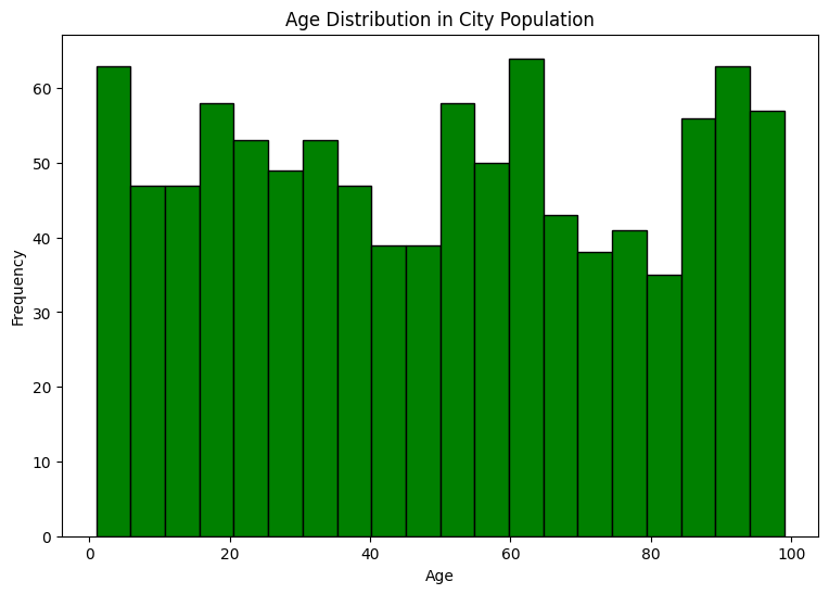
So, What We Learned:
- Most Common Ages: We saw that many people in the city are between 30 and 40 years old. This might mean there are lots of adults working or starting families in this age group.
- Spread of Ages: As we looked at younger and older ages, the number of people was fewer. This suggests there are fewer kids and older folks compared to the peak age group.
And how This Helps Planning:
- Planning for Jobs and Families: Knowing there are many adults in the city can help plan more jobs and activities for working adults and families.
- Services for Different Ages: Understanding there are fewer older and younger people helps decide how many services, like elderly care or daycare, might be needed.
By using histograms to look at ages in the city, we got a clearer picture of who lives there. This helps plan things better for everyone!


