Heatmaps in Matplotlib
Heatmaps in Matplotlib show data in colors on a grid. They help spot patterns or trends in large datasets. In a heatmap, each grid cell gets a color based on its data value. Darker colors usually mean higher values.
Heatmaps are commonly used in fields such as data analysis, biology, and finance for visualizing complex data structures and relationships.
Creating a Basic Heatmap
In Matplotlib, we can create a basic heatmap using the imshow() function. Here’s how to do it:
Example:
import matplotlib.pyplot as plt
import numpy as np

# Stir up some random data
data = np.random.rand(10, 10)

# Time to heat things up!
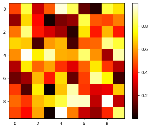
plt.imshow(data, cmap='hot', interpolation='nearest')
plt.colorbar()  # Adds a colorbar
plt.show()
In this code:
data = np.random.rand(10, 10): Makes a 10×10 grid filled with random numbers between 0 and 1.plt.imshow(data, cmap='hot', interpolation='nearest'): Turns the random data into colors. The ‘hot’ colorscheme makes low numbers black and high numbers yellow.interpolation='nearest': Keeps the edges between colors sharp. You can also use other values ofinterpolationlike –'bilinear','bicubic','spline16'.
Output:
Changing Color Transparency
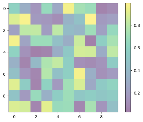
Adjust the transparency of colors in the heatmap using the alpha parameter. A value of 0 makes colors fully transparent, while 1 makes them fully opaque.
Example:
import matplotlib.pyplot as plt
import numpy as np

# Stir up some random data
data = np.random.rand(10, 10)

# Time to heat things up with 'viridis' colormap!
plt.imshow(data, cmap='viridis', interpolation='nearest', alpha=0.5)  # Setting alpha to 0.5 for transparency
plt.colorbar()  # Adds a legend to show intensity
plt.show()
Output:
Adding Gridlines
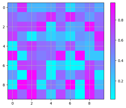
Display gridlines on the heatmap to better visualize data using the plt.grid() function.
Example:
import matplotlib.pyplot as plt
import numpy as np

# Stir up some random data
data = np.random.rand(10, 10)

# Time to heat things up with 'cool' colormap!
plt.imshow(data, cmap='cool', interpolation='nearest')
plt.colorbar()  # Adds a legend to show intensity
plt.grid(True)  # Turn on gridlines
plt.show()
Output:
Adjusting Aspect Ratio
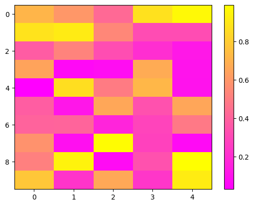
Change the aspect ratio of the heatmap using the aspect parameter in the plt.imshow() function. This allows you to stretch or compress the heatmap to better fit the data.
Example:
import matplotlib.pyplot as plt
import numpy as np

# Stir up some random data
data = np.random.rand(10, 5)  # Creating a non-square grid

# Time to heat things up with 'spring' colormap!
plt.imshow(data, cmap='spring', interpolation='nearest', aspect='auto')  # Setting aspect to 'auto' for automatic aspect ratio
plt.colorbar()  # Adds a legend to show intensity
plt.show()
Output:
Real-world Example: Visualizing Correlation Matrix with a Heatmap
Now, let’s dive into a real-world example of using a heatmap to visualize the correlation matrix of a dataset. We’ll be using Matplotlib to create a colorful representation of the relationships between different variables.
For this example, let’s imagine we have a dataset containing information about students, including their exam scores, study hours, and extracurricular activities. We want to understand how these variables are related to each other.
Loading the Dataset
First, let’s load a sample dataset using Pandas:
import pandas as pd

# Load sample dataset
data = {
    'Exam Score': [85, 90, 88, 78, 82],
    'Study Hours': [6, 5, 7, 4, 5],
    'Extracurricular Activities': [3, 2, 4, 1, 2]
}

df = pd.DataFrame(data)
Calculating the Correlation Matrix
Next, let’s calculate the correlation matrix using Pandas:
# Calculate correlation matrix
correlation_matrix = df.corr()
Visualizing the Correlation Matrix with a Heatmap
Now, let’s use Matplotlib to create a heatmap of the correlation matrix:
import matplotlib.pyplot as plt

# Create heatmap
plt.imshow(correlation_matrix, cmap='coolwarm', interpolation='nearest')
plt.colorbar()  # Adds a legend to show correlation scale
plt.title('Correlation Matrix')
plt.xticks(range(len(correlation_matrix.columns)), correlation_matrix.columns, rotation=45)
plt.yticks(range(len(correlation_matrix.columns)), correlation_matrix.columns)
plt.show()
Output:
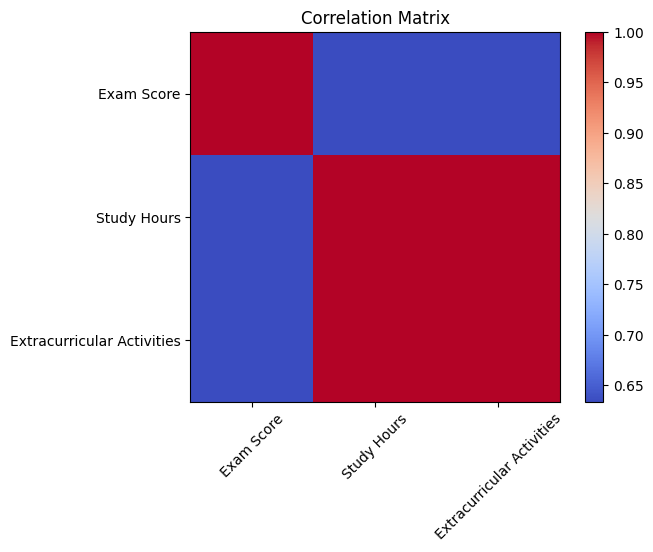
In our heatmap:
- Each cell represents the correlation coefficient between two variables.
- Warmer colors (e.g., red) indicate positive correlations, while cooler colors (e.g., blue) indicate negative correlations.
- Closer to 1 or -1 indicates a stronger correlation, while closer to 0 indicates a weaker correlation.
Visualizing the correlation matrix with a heatmap provides valuable insights into the relationships between variables in our dataset.


