Bar Plot
A bar plot is a type of chart that uses rectangular bars to represent data. Each bar corresponds to a category, and the length of the bar represents the value of the data. Bar graphs are effective for comparing different categories or showing changes over time.
Imagine you have categories or groups you want to compare—sales by different months, the performance of various teams, or maybe the popularity of ice cream flavors. Bar plots come in handy to compare these categories easily and visually.

Creating a Basic Bar Plot
We’ll start with a basic bar graph using Matplotlib. Imagine we have some data showing the sales figures for different months:
Example:
import matplotlib.pyplot as plt

# Sample data for monthly sales
months = ['Jan', 'Feb', 'Mar', 'Apr', 'May']
sales = [120, 150, 200, 180, 210]

# Plotting a basic bar graph
plt.bar(months, sales)
plt.xlabel('Months')
plt.ylabel('Sales')
plt.title('Monthly Sales Performance')
plt.show()
Output:
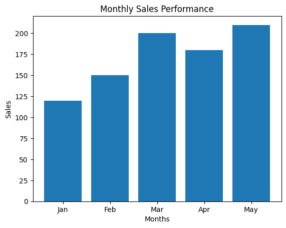
We just created a simple bar graph showing the sales performance for each month. Each bar represents the sales figure for a particular month.
Customizing Bar Colors, Widths, and Positions
In Matplotlib, you can customize bar plots further by adjusting their colors, widths, edge colors, and positions using options such as color, width, edgecolor, align. Here’s how you can do it:
import matplotlib.pyplot as plt

# Sample data for monthly sales
months = ['Jan', 'Feb', 'Mar', 'Apr', 'May']
sales = [120, 150, 200, 180, 210]

# Customizing the bar graph
plt.bar(months, sales, color=['skyblue', 'lightgreen', 'lightcoral', 'lightsalmon', 'lightsteelblue'], width=0.6, edgecolor='black', align='center')

# Adding labels and a title
plt.xlabel('Months', fontsize=12, fontweight='bold', color='dimgrey')
plt.ylabel('Sales', fontsize=12, fontweight='bold', color='dimgrey')
plt.title('Monthly Sales Performance', fontsize=14, fontweight='bold', color='navy')


# Displaying the graph
plt.show()
Output:
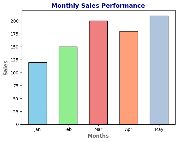
Side-by-Side Bar Plots
Sometimes, we need to compare multiple sets of data on one graph to spot trends or differences easily. With Matplotlib, we can do this by stacking or arranging bars side by side.
Imagine we want to compare the sales figures of two different products across different months. Side-by-side bar graphs are perfect for this!
Example:
import matplotlib.pyplot as plt

# Sample data for two products' sales across months
months = ['Jan', 'Feb', 'Mar', 'Apr', 'May']
product1_sales = [120, 150, 200, 180, 210]
product2_sales = [100, 130, 190, 160, 190]

# Creating side-by-side bar graphs for product comparison
plt.bar(months, product1_sales, width=0.4, align='center', label='Product 1')
plt.bar([x + 0.4 for x in range(len(months))], product2_sales, width=0.4, align='center', label='Product 2')
plt.xlabel('Months')
plt.ylabel('Sales')
plt.title('Comparison of Product Sales')
plt.legend()
plt.show()
Output:
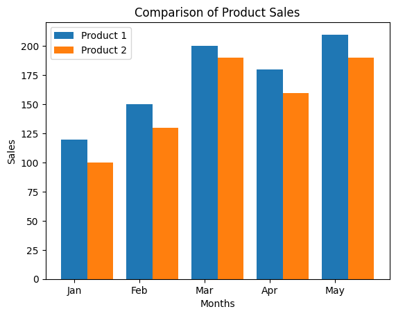
We’ve got a clear comparison between the sales figures of two products for each month. The bars are positioned side by side, making it easy to compare the performance of both products.
Stacked Bar Plots
Stacked bar graphs are useful when you want to showcase the total as well as the individual contributions to that total. Let’s imagine we want to show the revenue split between different regions for a company:
Example:
import matplotlib.pyplot as plt

# Sample data for revenue split among different regions
regions = ['North', 'South', 'East', 'West']
revenue_Q1 = [300, 250, 400, 350]
revenue_Q2 = [350, 300, 450, 380]

# Creating stacked bar graphs for revenue split
plt.bar(regions, revenue_Q1, label='Q1')
plt.bar(regions, revenue_Q2, bottom=revenue_Q1, label='Q2')
plt.xlabel('Regions')
plt.ylabel('Revenue')
plt.title('Revenue Split by Region')
plt.legend()
plt.show()
Output:
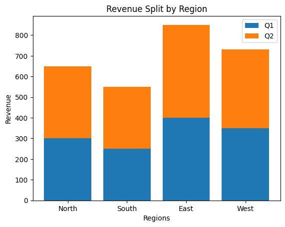
Now we have a stacked bar graph displaying the total revenue for each region (Q1 + Q2) and the split between Q1 and Q2. Each bar represents the total revenue for a region, and the sections within the bar show the revenue split between quarters.
Make Bar Plots Informative with Annotations
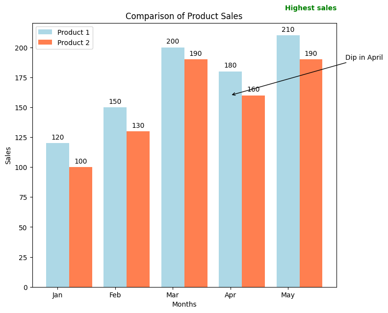
Adding annotations can make bar graphs even more informative. Annotations provide additional context and insights into the data presented in the graph. Here’s how you can enhance bar graphs with annotations using Matplotlib:
Example:
import matplotlib.pyplot as plt

# Sample data for two products' sales across months
months = ['Jan', 'Feb', 'Mar', 'Apr', 'May']
product1_sales = [120, 150, 200, 180, 210]
product2_sales = [100, 130, 190, 160, 190]

# Creating side-by-side bar graphs with vibrant colors
plt.bar(months, product1_sales, width=0.4, align='center', label='Product 1', color='lightblue')
plt.bar([x + 0.4 for x in range(len(months))], product2_sales, width=0.4, align='center', label='Product 2', color='coral')

# Adding labels to the bars
for i in range(len(months)):
    plt.text(i, product1_sales[i] + 5, str(product1_sales[i]), ha='center', va='bottom')
    plt.text(i + 0.4, product2_sales[i] + 5, str(product2_sales[i]), ha='center', va='bottom')

# Adding annotations for insights
plt.text(2.5, 230, 'Highest sales', ha='center', va='bottom', color='green', fontsize=10, weight='bold')
plt.annotate('Dip in April', xy=(3, 160), xytext=(4, 190), arrowprops=dict(facecolor='black', arrowstyle='->'))

# Adding titles, labels, and enhancing colors
plt.xlabel('Months')
plt.ylabel('Sales')
plt.title('Comparison of Product Sales')
plt.legend()
plt.show()
In this code, plt.text() and plt.annotate() functions are used for adding text annotations:
plt.text()places text at specified coordinates (x, y) on the plot. It’s used to label the sales figures on the bars.plt.annotate()creates an annotation with an arrow, specifying the text ('Dip in April') and its location on the graph.colorparameter inplt.bar()is used to set the color of the bars.
Output:
Real-Life Example of Bar Plot: Exploring Ice Cream Flavor Popularity Across Seasons

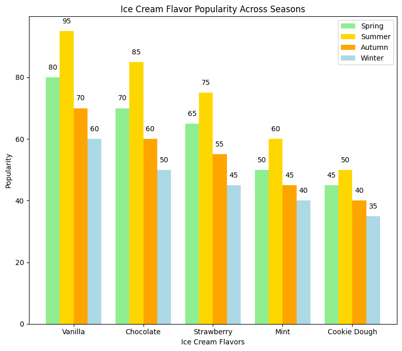
Imagine we’re running an ice cream parlor that serves various flavors throughout the year. We want to visualize the popularity of different ice cream flavors across seasons to plan our inventory better and offer customers their favorite flavors at the right time.
Example:
import matplotlib.pyplot as plt

# Sample data for ice cream flavor popularity across seasons
flavors = ['Vanilla', 'Chocolate', 'Strawberry', 'Mint', 'Cookie Dough']
spring_popularity = [80, 70, 65, 50, 45]
summer_popularity = [95, 85, 75, 60, 50]
autumn_popularity = [70, 60, 55, 45, 40]
winter_popularity = [60, 50, 45, 40, 35]

# Create a figure with a specific size (width, height)
plt.figure(figsize=(8, 7))

# Creating grouped bar graphs to visualize flavor popularity across seasons
bar_width = 0.2
index = [i for i in range(len(flavors))]

plt.bar(index, spring_popularity, width=bar_width, align='center', label='Spring', color='lightgreen')
plt.bar([i + bar_width for i in index], summer_popularity, width=bar_width, align='center', label='Summer', color='gold')
plt.bar([i + 2 * bar_width for i in index], autumn_popularity, width=bar_width, align='center', label='Autumn', color='orange')
plt.bar([i + 3 * bar_width for i in index], winter_popularity, width=bar_width, align='center', label='Winter', color='lightblue')

# Adding labels to the bars
for i in range(len(flavors)):
    plt.text(i, spring_popularity[i] + 2, str(spring_popularity[i]), ha='center', va='bottom')
    plt.text(i + bar_width, summer_popularity[i] + 2, str(summer_popularity[i]), ha='center', va='bottom')
    plt.text(i + 2 * bar_width, autumn_popularity[i] + 2, str(autumn_popularity[i]), ha='center', va='bottom')
    plt.text(i + 3 * bar_width, winter_popularity[i] + 2, str(winter_popularity[i]), ha='center', va='bottom')

# Adding titles, labels, and legend
plt.xlabel('Ice Cream Flavors')
plt.ylabel('Popularity')
plt.title('Ice Cream Flavor Popularity Across Seasons')
plt.xticks([i + 1.5 * bar_width for i in index], flavors)
plt.legend()
plt.tight_layout()
plt.show()
In this example:
- Data: We have data for the popularity of five ice cream flavors (Vanilla, Chocolate, Strawberry, Mint, Cookie Dough) across four seasons (Spring, Summer, Autumn, Winter).
- Visualization: Using grouped bar plots, each flavor’s popularity is represented by bars grouped by season.
- Annotations:
plt.text()is used to label each bar with its respective popularity value.
Output:
Insights:
- Vanilla and Chocolate remain popular across all seasons.
- Mint and Cookie Dough are more popular in warmer seasons (Spring and Summer) compared to colder ones.
- Strawberry shows a consistent but moderate popularity across seasons.

