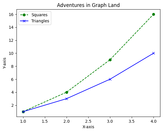
Understanding Axes and Ticks
In Matplotlib, axes and ticks are essential components for creating and customizing plots. Let’s understand what they are and how they work:

Axes(x-axis and y-axis) are the bounding box or region where data is plotted in a Matplotlib figure. They provide the framework for plotting data points and visualizing information. When you create a plot using Matplotlib, you’re essentially creating an instance of the Axes class.
Ticks are the markers along the axes that denote specific data values or intervals. They provide reference points for interpreting the data plotted on the axes. Matplotlib supports both major and minor ticks, allowing for finer control over the positioning and labeling of ticks. Major ticks typically correspond to larger intervals, while minor ticks represent smaller subdivisions within those intervals.
Set the Limits on Axes
In Matplotlib, xlim() and ylim() are methods used to set the limits or range of values displayed on the x-axis and y-axis, respectively. They allow you to specify the minimum and maximum values for each axis, controlling the extent of the plot area.
Let’s imagine we’re tracking a plant’s growth over time and we want to focus on its early days. We’ll zoom into those first few days using xlim() and ylim() functions.
Example:
import matplotlib.pyplot as plt

# Our plant's growth data: Days vs. Height
days = [1, 2, 3, 4, 5, 6, 7, 8, 9, 10]
height = [2, 4, 6, 8, 10, 12, 14, 16, 18, 20]

# Let's draw our growth chart
plt.plot(days, height, marker='o', linestyle='-', color='green')
plt.xlabel('Days')
plt.ylabel('Height (inches)')

# Zooming into the early days of growth
plt.xlim(1, 5)  # Show only the first 5 days on the X-axis
plt.ylim(0, 12)  # Display heights from 0 to 12 inches on the Y-axis

plt.title('Plant Growth Adventure')
plt.show()
Output:
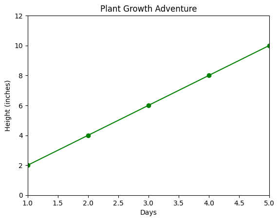
Our graph shows how tall our plant gets each day in this plant growth. By setting the X-axis to only show the first 5 days and the Y-axis to display heights up to 12 inches, we’re like zooming in on the plant’s early growth.
Changing the Appearance of Ticks
You can customize the appearance of ticks, including their location, length, width, and label format using the tick_params() method.
Here’s a table of all the parameters of tick_params() for changing the appearance of ticks:
| Parameter | Description |
|---|---|
axis | The axis to apply the changes to ('x', 'y', or 'both') |
which | Which ticks to apply the changes to ('major', 'minor', or 'both') |
direction | The direction of the ticks ('in', 'out', or 'inout') |
length | The length of the ticks in points |
width | The width of the ticks in points |
colors | The color of the ticks |
labelsize | The font size of the tick labels |
labelcolor | The color of the tick labels |
labelrotation | The rotation angle of the tick labels in degrees |
labelalignment | The alignment of the tick labels ('center', 'right', 'left') |
Example:
import matplotlib.pyplot as plt

# Sample data
years = [2018, 2019, 2020, 2021, 2022]
profits = [50000, 60000, 75000, 90000, 85000]

# Adjusting radius and adding a shadow effect
plt.figure(figsize=(7,5))

# Plotting the data
plt.plot(years, profits, marker='o', linestyle='-', color='orange')
plt.xlabel('Years')
plt.ylabel('Profits')

# Changing tick appearance: size, color, and style
plt.tick_params(axis='x', labelsize=15, labelcolor='purple', rotation=45, direction='inout', length=8, width=2)
plt.tick_params(axis='y', labelsize=12, labelcolor='green', direction='out', length=6, width=1.5)

plt.title('Annual Profits Trend')
plt.show()
Output:
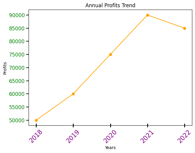
In this example, we’ve got our annual profits data. By customizing our ticks, we’re making our graph stand out! The X-axis ticks are now purple, rotated by 45 degrees, and have longer, thicker lines with both inward and outward directions. Meanwhile, the Y-axis ticks are green, slightly smaller, and positioned outward, giving our graph a unique stylish look!
Show and Customize Minor Ticks
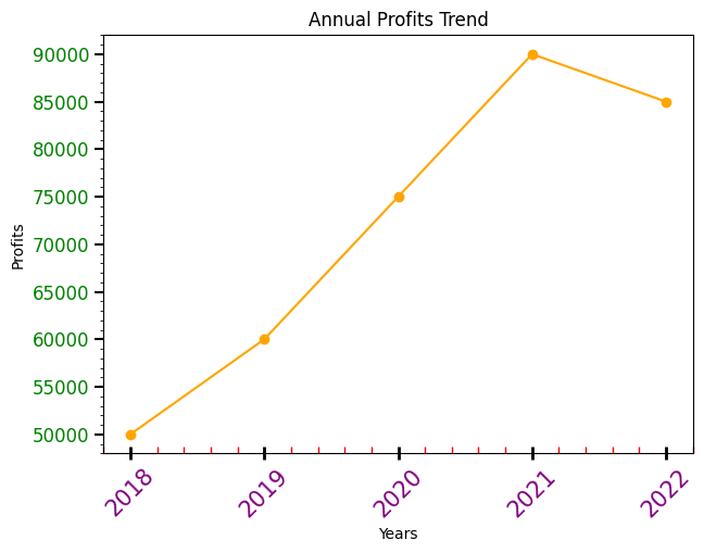
You can show the Minor ticks using the minorticks_on() method. And like major ticks, you can also customize the appearance of minor ticks. They usually do not have labels, but you can customize their appearance using other parameters in the tick_params() method.
Let’s do some changes in the previous example:
Example:
import matplotlib.pyplot as plt

# Sample data
years = [2018, 2019, 2020, 2021, 2022]
profits = [50000, 60000, 75000, 90000, 85000]

# Adjusting radius and adding a shadow effect
plt.figure(figsize=(7, 5))

# Plotting the data
plt.plot(years, profits, marker='o', linestyle='-', color='orange')
plt.xlabel('Years')
plt.ylabel('Profits')

# Changing tick appearance: size, color, and style
plt.tick_params(axis='x', labelsize=15, labelcolor='purple', rotation=45, direction='inout', length=8, width=2)
plt.tick_params(axis='y', labelsize=12, labelcolor='green', direction='out', length=6, width=1.5)

# Customizing minor ticks
plt.minorticks_on()  # Turn on minor ticks
plt.tick_params(axis='x', which='minor', direction='in', length=4, width=1, color='red')  # Customize minor tick appearance

plt.title('Annual Profits Trend')
plt.show()
Output:
Multiple Y-Axis
With multiple Y-axes, you can plot different datasets on the same graph, each with its scale.
Here’s an example demonstrating how to create a graph with multiple Y-axes for different datasets using Matplotlib:
Example:
import matplotlib.pyplot as plt

# Generating some sample data
x = [1, 2, 3, 4, 5]
data1 = [10, 15, 25, 30, 35]
data2 = [100, 90, 80, 70, 60]

# Creating the figure and axes
fig, ax1 = plt.subplots()

# Creating the second Y-axis
ax2 = ax1.twinx()

# Plotting data on the first Y-axis
ax1.plot(x, data1, color='red', marker='o', label='Data 1')
ax1.set_ylabel('Data 1', color='red')  # Labeling the first Y-axis

# Plotting data on the second Y-axis
ax2.plot(x, data2, color='blue', marker='x', label='Data 2')
ax2.set_ylabel('Data 2', color='blue')  # Labeling the second Y-axis

# Adding legend and title
ax1.legend(loc='center left')
ax2.legend(loc='center right')
plt.title('Multiple Y-Axes for Different Datasets')

plt.show()
Explanation:
- We create a figure and an axis
ax1usingplt.subplots(). ax2is created as a twin axis ofax1usingax1.twinx(), which allows us to have a second Y-axis.- Two datasets,
data1anddata2, are plotted onax1andax2respectively. - Labels for both Y-axes are set using
set_ylabel(). - Legends are added for both datasets using
ax1.legend()andax2.legend(). - Finally,
plt.show()displays the graph.
Output:
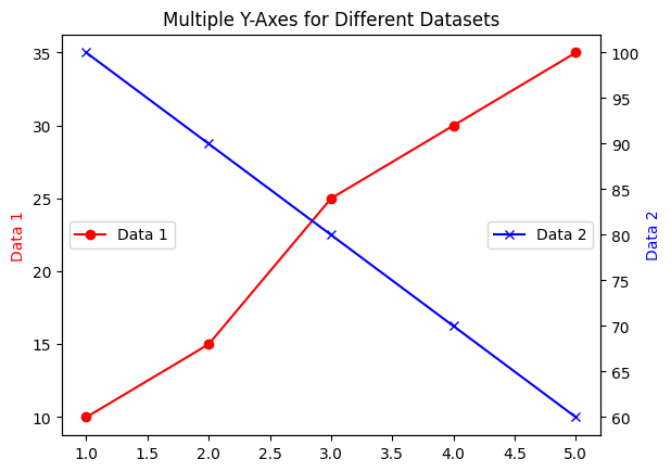
This example showcases a graph with two Y-axes displaying different datasets, allowing for better comparison and visualization of data with distinct scales.
Using Secondary Axes
Secondary axes let you compare two datasets that might have different units but are related.
Let’s create a graph that uses secondary axes for better comparison between two datasets—a superhero’s strength and their daily pizza intake.
Example:
import matplotlib.pyplot as plt

# Days of the week
days = ['Mon', 'Tue', 'Wed', 'Thu', 'Fri', 'Sat', 'Sun']

# Superhero's strength data
strength = [80, 65, 90, 58, 92, 77, 85]

# Pizza intake in slices
pizza_slices = [7, 4, 15, 6, 30, 7, 5]

# Creating the figure and main axis
fig, ax1 = plt.subplots()

# Creating a secondary Y-axis
ax2 = ax1.secondary_yaxis('right')

# Plotting the superhero's strength on the main Y-axis
ax1.plot(days, strength, color='blue', marker='o', label='Strength')
ax1.set_ylabel('Strength', color='blue')  # Labeling the main Y-axis

# Plotting the pizza intake on the secondary Y-axis
ax1.plot(days, pizza_slices, color='green', marker='x', label='Pizza')
ax2.set_ylabel('Pizza Intake', color='green')  # Labeling the secondary Y-axis

# Adding legend and title
ax1.legend(loc='center')
ax1.legend(loc='center')
plt.title('Superhero Strength vs. Pizza Intake')

plt.show()
Here’s what’s happening:
- We’re creating a graph to showcase a superhero’s strength (in arbitrary units) and their daily pizza intake (in slices).
ax1is our main axis where we plot the superhero’s strength.- We use
ax1.secondary_yaxis('right')to create a secondary Y-axis on the right side of the graph for pizza intake. - Both datasets—strength and pizza intake—are plotted on their respective axes.
- Labels for both Y-axes are set using
set_ylabel()for clarity. - Legend is added for both datasets using
ax1.legend(). - Finally,
plt.show()displays the graph.
Output:
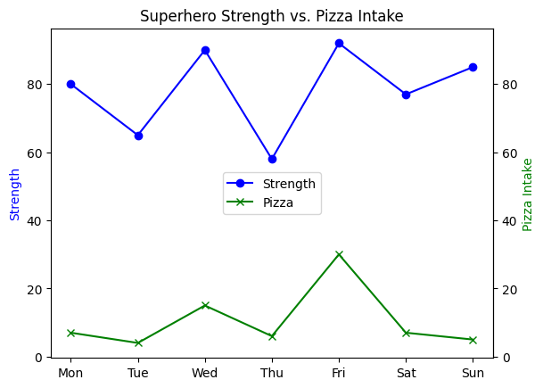
This graph with secondary axes helps compare the superhero’s strength and pizza intake on the same canvas, allowing us to see any correlations between these seemingly unrelated data points!